Conurwines is a wine brand born in Portland, Oregon, founded by four friends whose passion for wine, friendship, and football brought them together over time. The project blends two worlds: the Argentine wine tradition rooted in their origins, and the freshness and innovation of Portland, where the brand took shape.
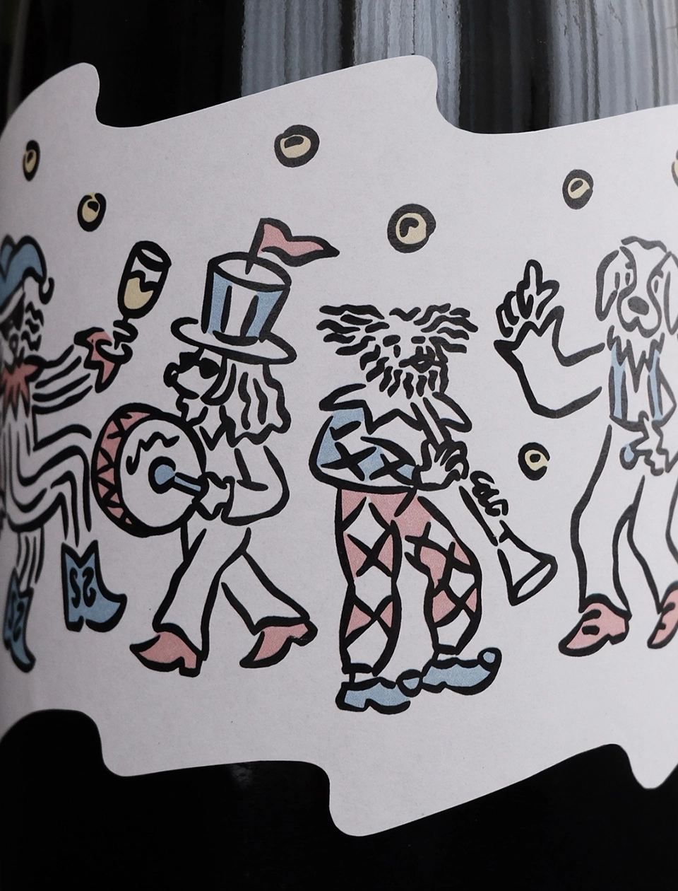
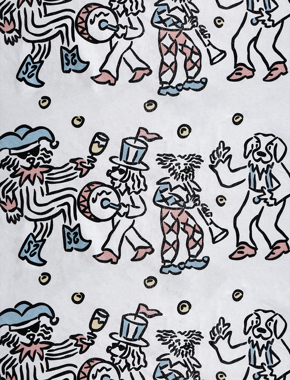
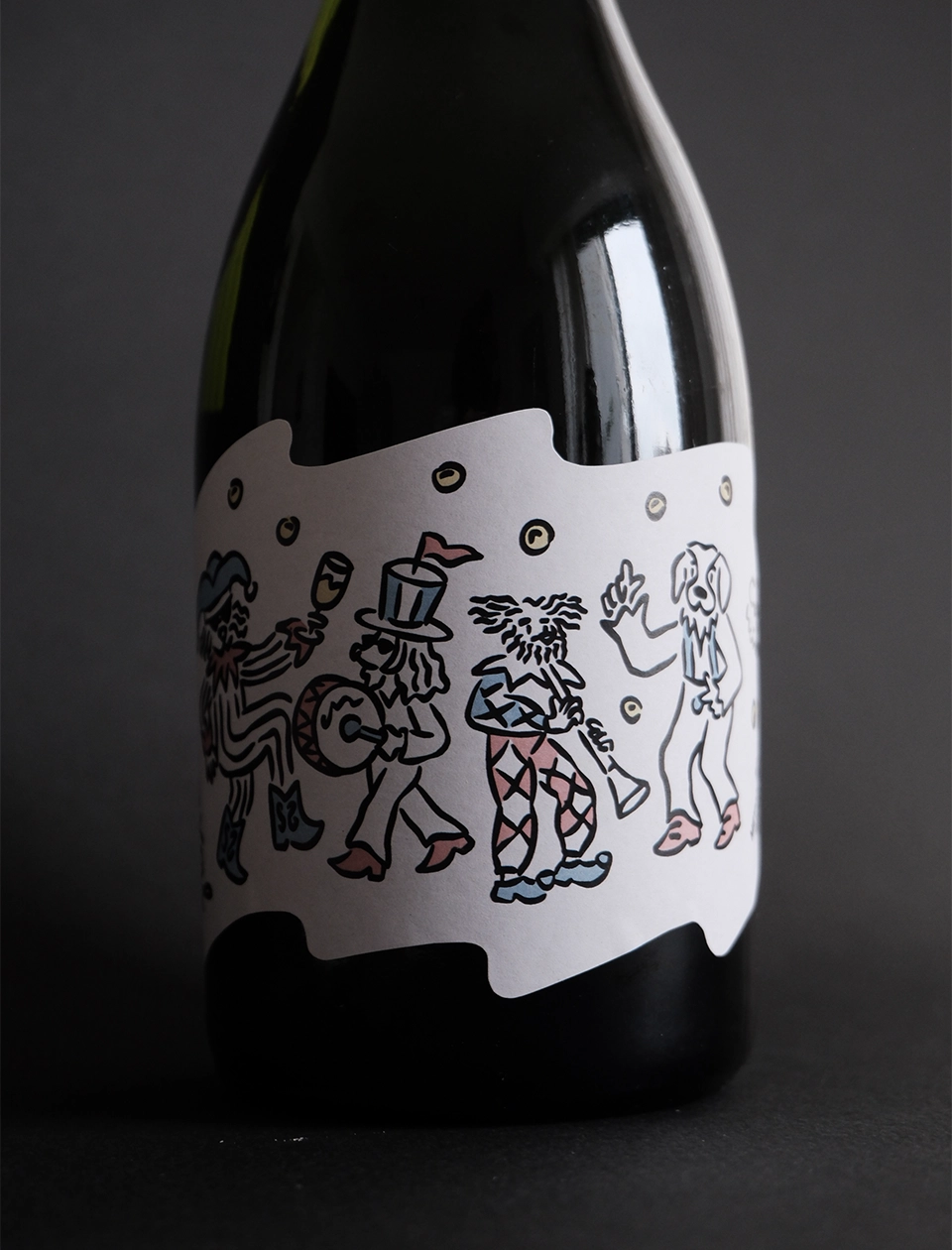
More than a year ago, we developed the brand’s visual identity and the complete set of wine labels. Today, the project continues to grow with new product lines, including this new sparkling wine. The goal was to design labels as narrative pieces. Each wine, from the core line to the new releases, tells its own story, connected to the brand’s origins and its protagonists: four friends and a dog, Sote, that became the symbol of the project.
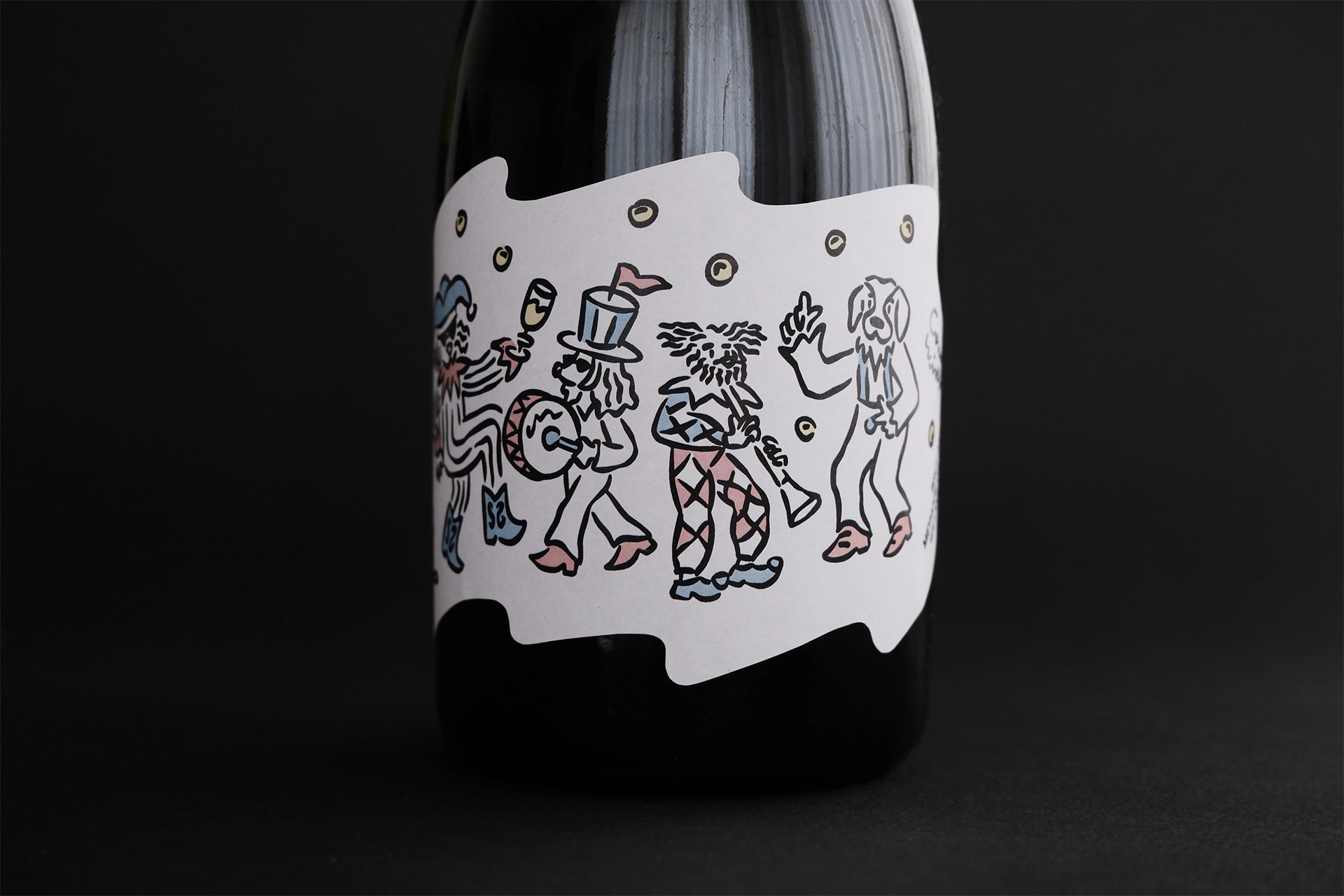
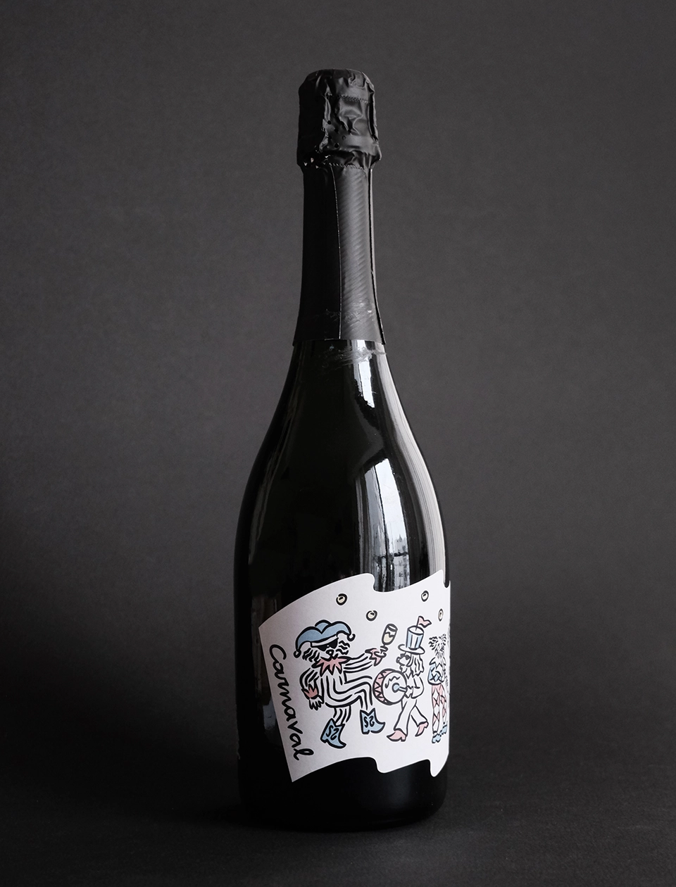
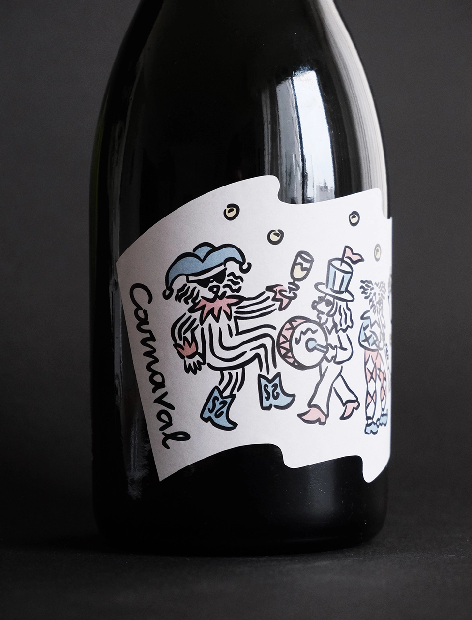
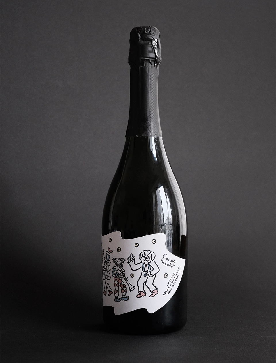
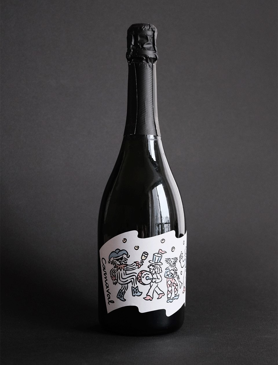
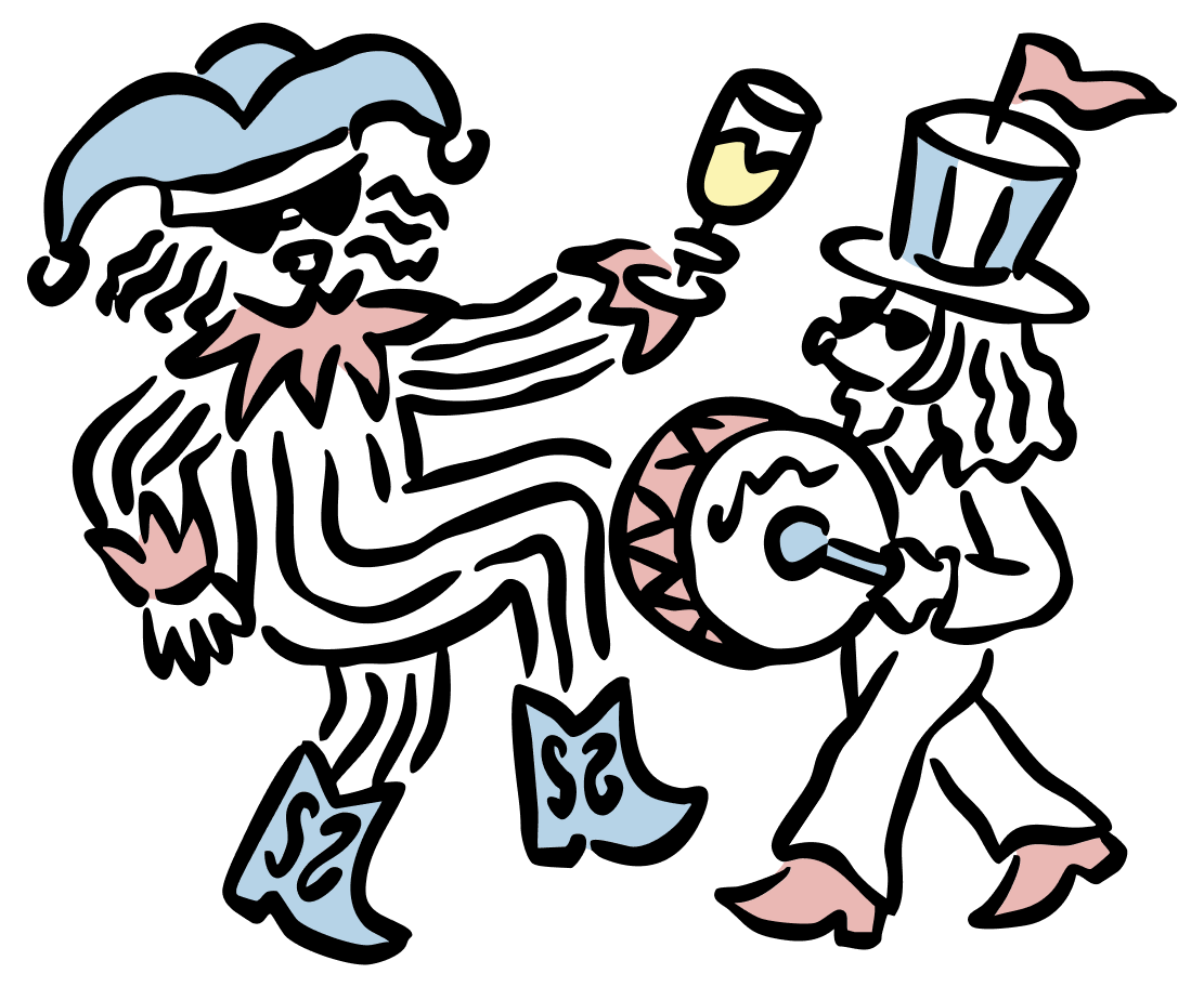
Carnaval is joy, movement, and bubbles. Music, toasts, and color in motion. This label was designed to capture that feeling: The energy that bursts free every time the bottle is opened.
For this release, we designed a flag-shaped label, inspired by celebration and festivity. The format reinforces the idea of Carnival as a moment of gathering and joy, while the illustration brings all the brand’s characters together in a more festive look, emphasizing the playful and celebratory spirit of this sparkling wine.