A brand that talks about real food needs branding that feels real. Hey Baby® is a conscious nutrition brand for babies and early childhood, offering meals made with real ingredients to support feeding from the very first months. As the brand grew, its identity needed to evolve as well. This led to a comprehensive rebranding project. The goal was not to discard what had already been built, but to value the brand’s history and understand which elements could be preserved, transformed, or improved.
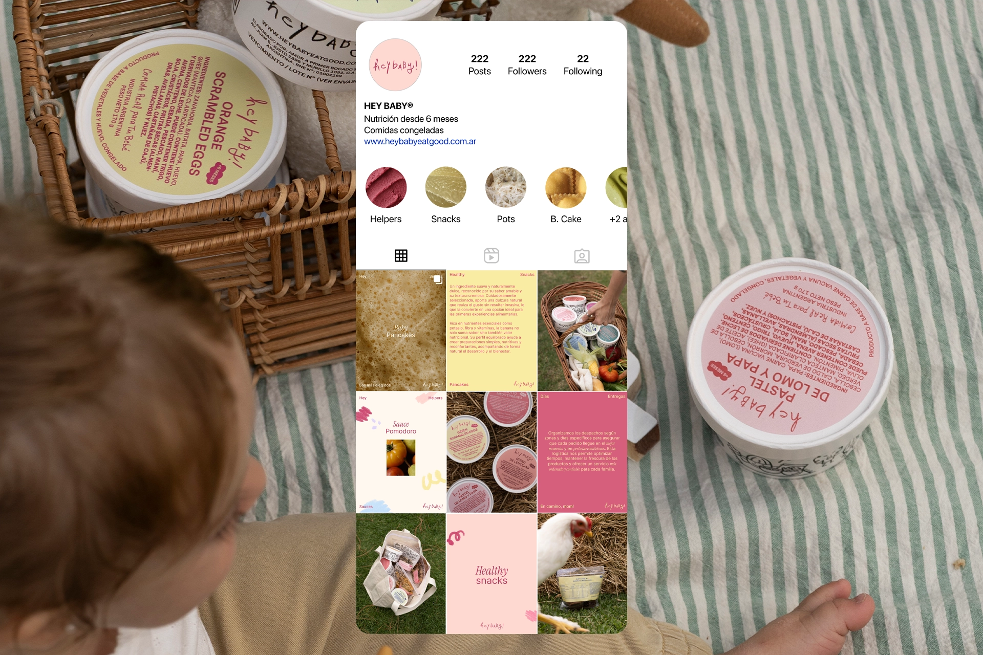
As part of the rebrand, we developed a new color palette, typography, graphic resources, and photographic style, along with the visual identity for social media and the website: how the brand communicates, how its posts and stories look, and the visual universe that accompanies its everyday communication.
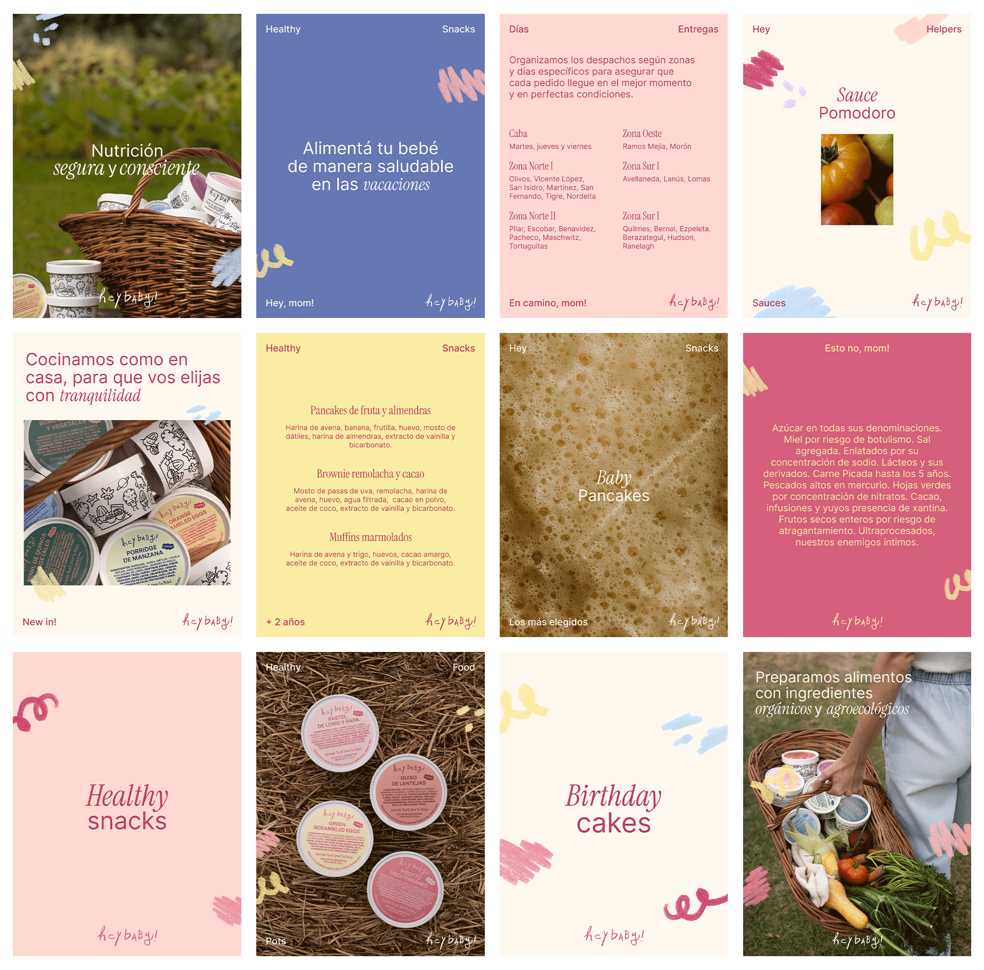
One of the most significant changes was the introduction of more color into the visual system. Color is part of the essence of Hey Baby: childhood is movement, discovery, and color. We wanted that energy to be present in the identity while maintaining a clear, thoughtful, and professional tone for parents. The challenge was finding that balance: an organized identity for adults that still allowed the true protagonists to shine through.
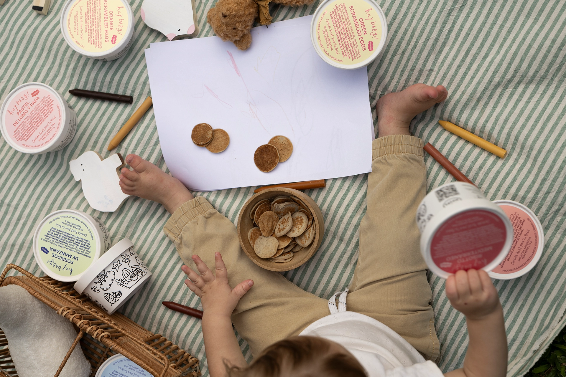
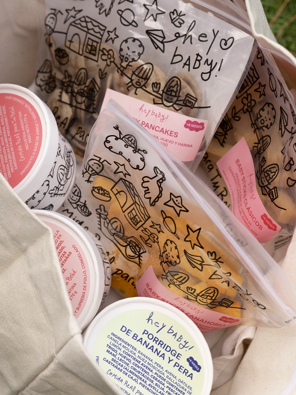
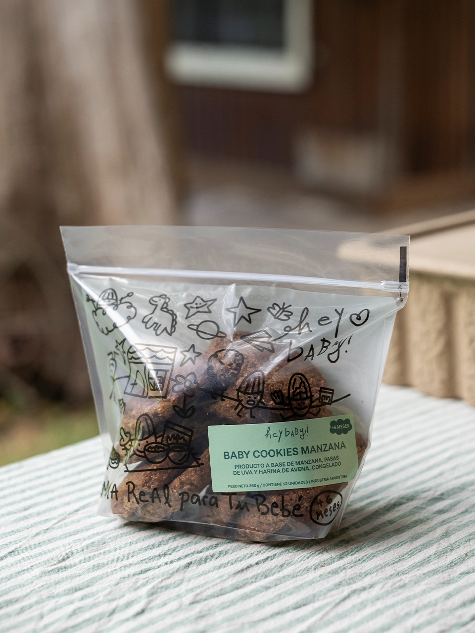
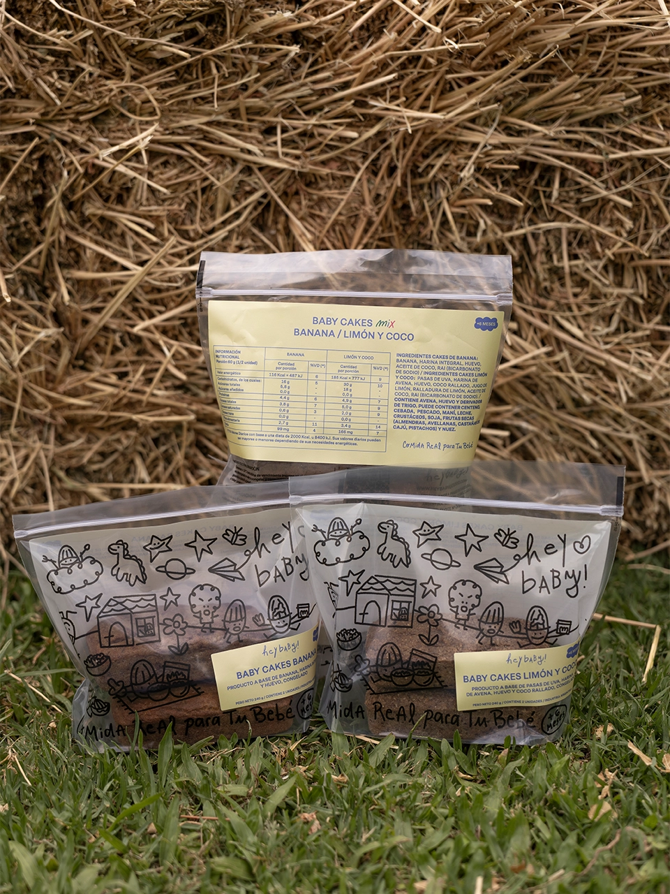
For this reason, we incorporated more spontaneous graphic gestures: strokes, crayons, and drawings, that introduce something playful, imperfect, and lively from the world of childhood into the brand system.
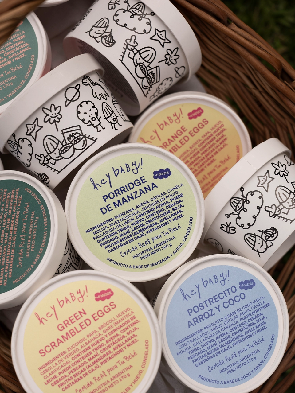
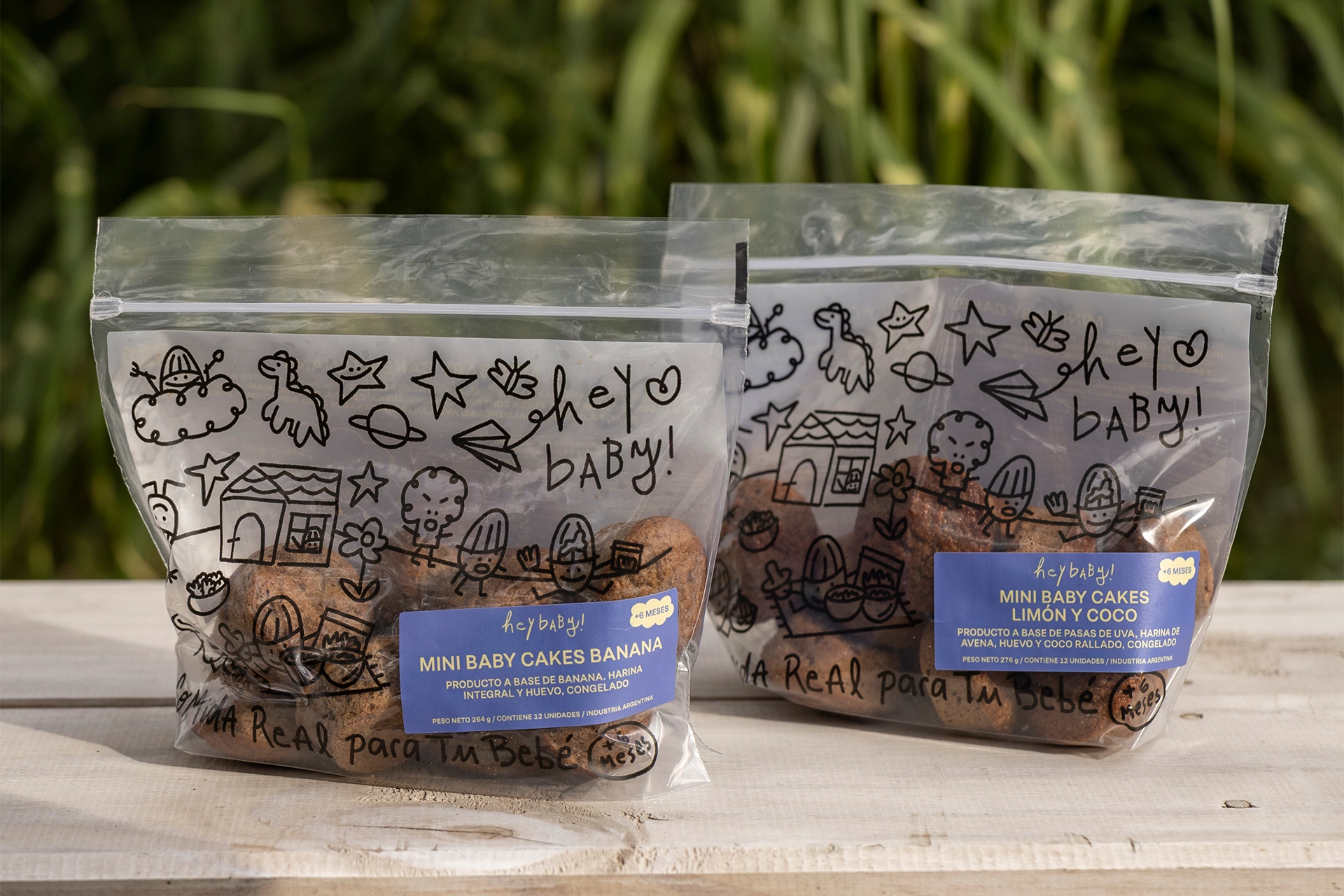
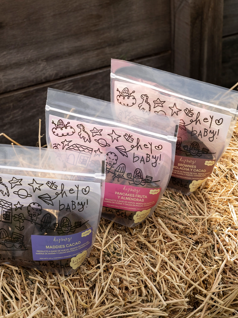
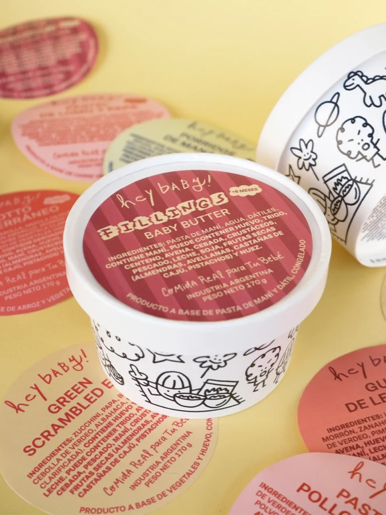
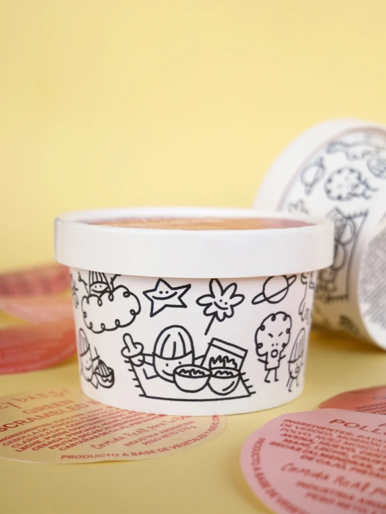
We also developed the universe of Avenito, a small personified oat grain that is part of the brand’s world and appears in many of its illustrations and products. In these scenes, he can be seen alongside his friends: playing, running, escaping from a broccoli, or getting messy while eating. Simple situations that connect with the real world of babies.
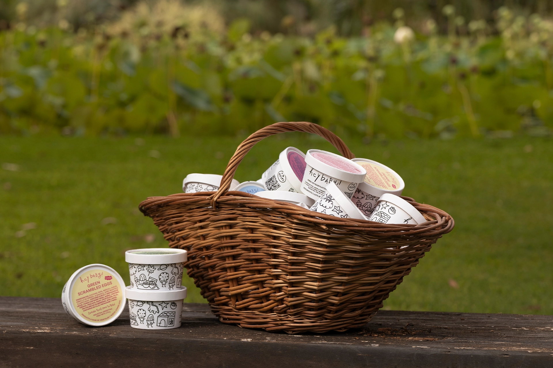
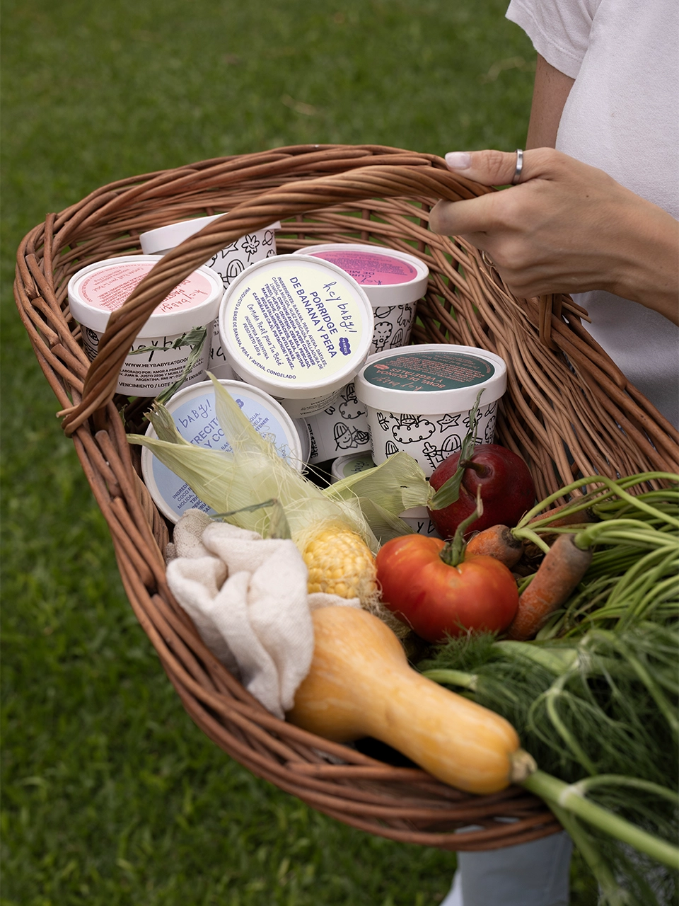
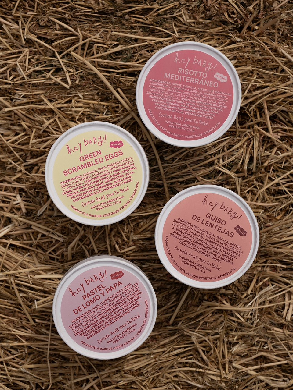
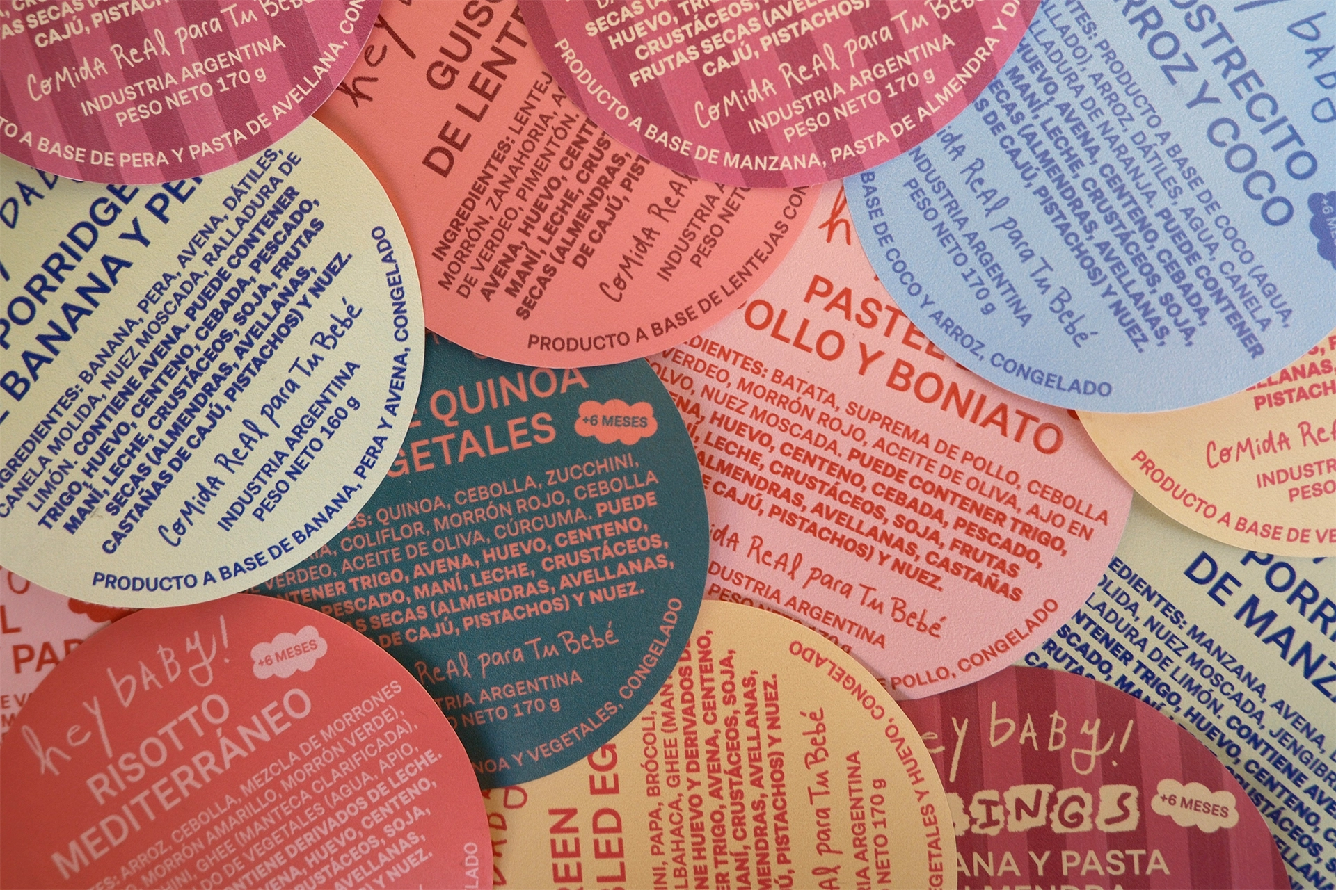
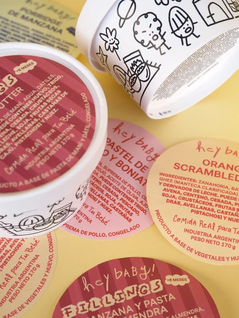
The biggest challenge of the rebrand was the development of the labeling and packaging system. Hey Baby has more than five product lines and over 45 products, distributed across different formats and categories. The main resource was the use of color as a system, creating a chromatic code that differentiates product lines and variants while maintaining a clear and coherent identity across the entire catalog.
Snacks, meals for different ages, helpers, and special products such as the birthday line coexist within this visual system, adapting to different label and packaging formats. In addition, custom illustrations from Avenito’s universe were developed and appear on many of the products, designed as a distinctive element of the brand.
We also developed the social media visual identity as an extension of the brand system. A set of editable templates for posts and stories was created to ensure consistent and recognizable communication, adapted to the everyday needs of a nutrition brand for babies and early childhood.
Client: Hey Baby® Location: Buenos Aires, Argentina Year: 2026 Work: Branding, Packaging, Illustrations, Brand Applications, Social Media Identity