Partners is a bakery and coffee shop based in Trinidad and Tobago, specializing in sourdough breads and French pastry. The brand was born from the crossing of two paths through friendship and a shared love for what they do, and grew into a project built together.
For this rebrand, we aimed for the change to be perceived as an evolution and a step toward further professionalization, while keeping the brand’s essence intact. From an aesthetic point of view, we wanted it to continue reflecting what makes it so special: warmth, closeness, and the artisanal nature of its products. We wanted to change the packaging, not the content.
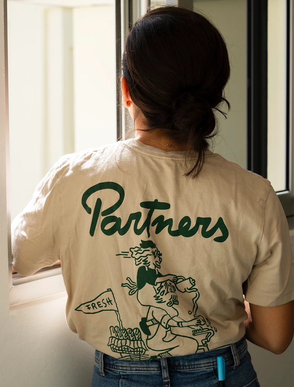
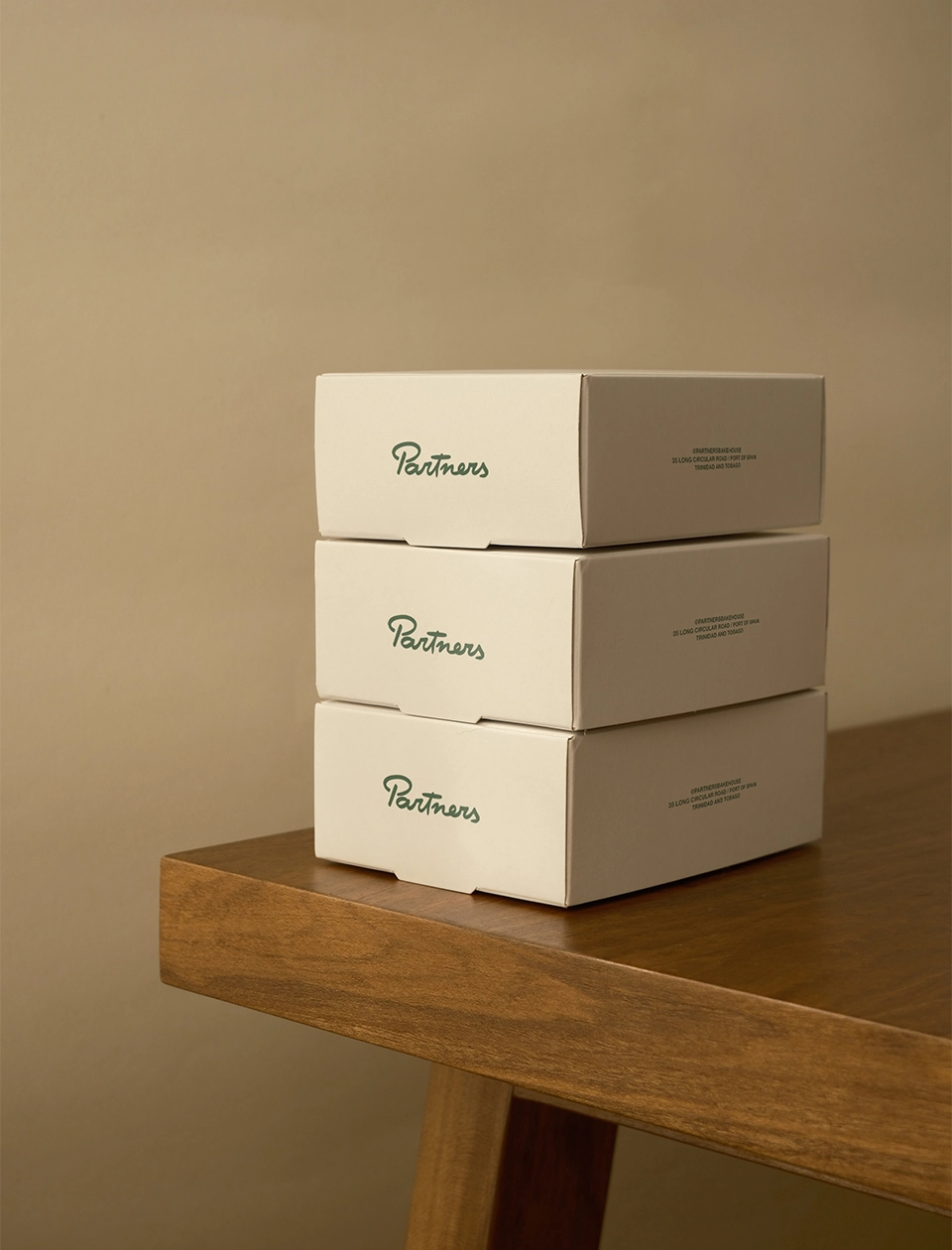
For Partners, we developed a complete visual identity system, including logo suite, color palette, typography, illustrations, patterns, iconography, brand applications, packaging, and social media look & feel.
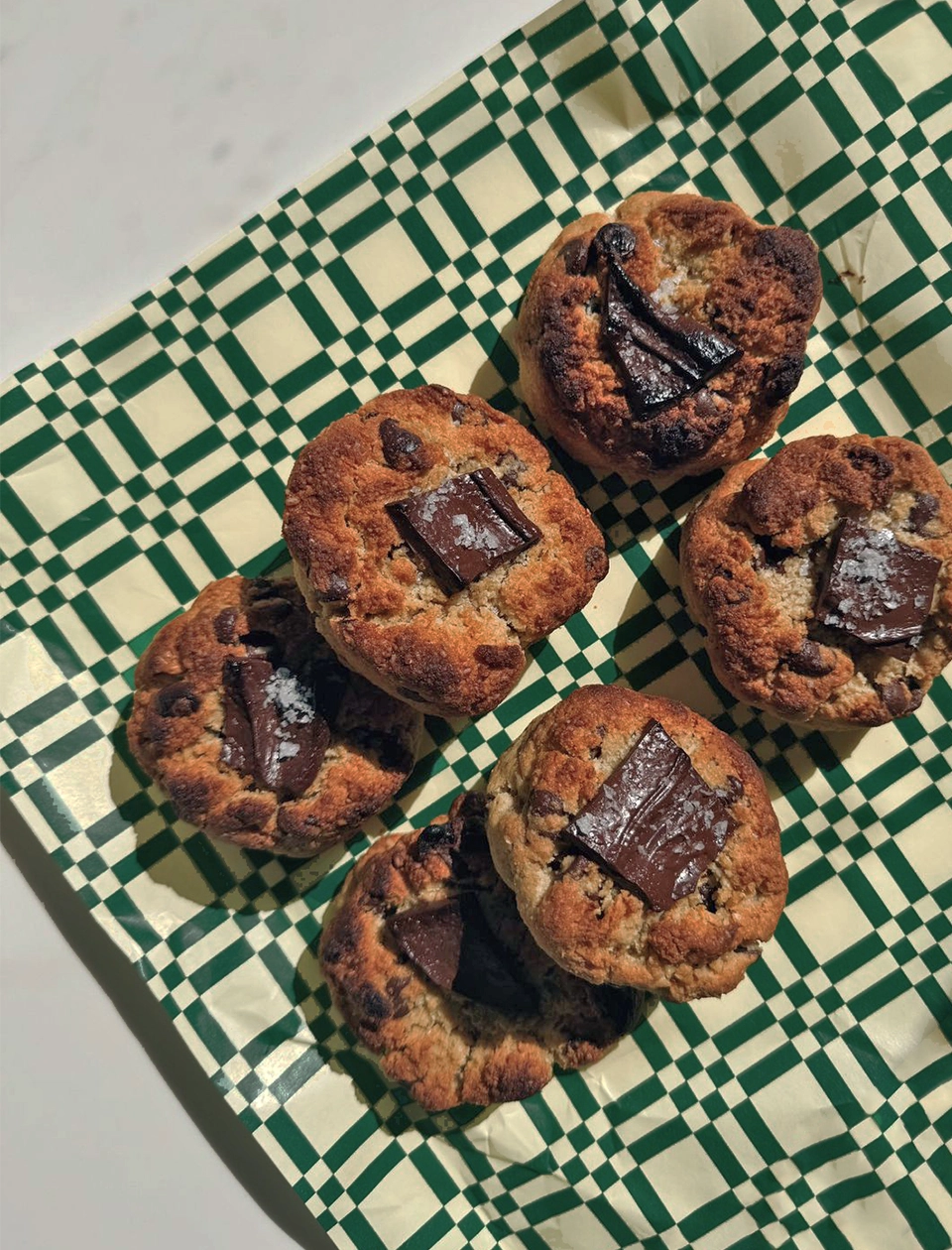
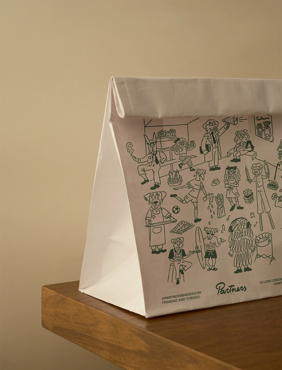
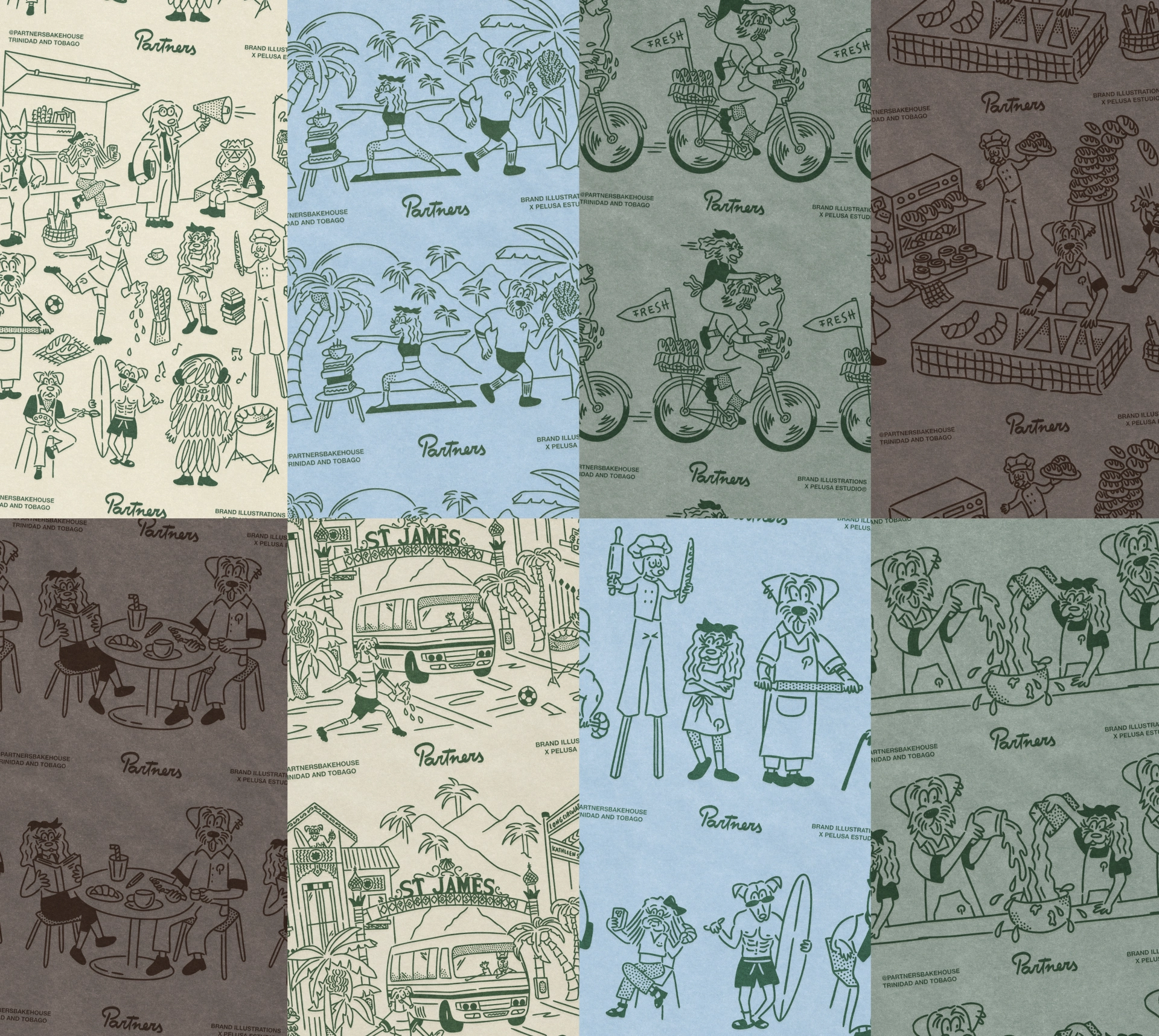
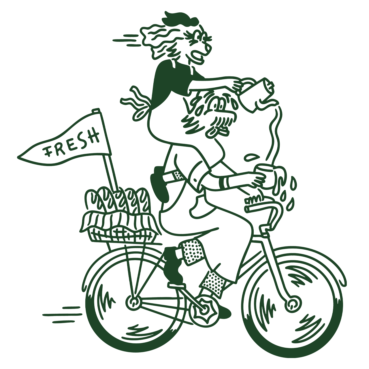
This branding project places graphic resources at the core of the identity. We designed a distinctive checkered pattern that became a key visual element across multiple touchpoints, from the physical space to packaging. Illustration also plays a central role, functioning not as a decorative layer but as a fundamental storytelling tool throughout the brand’s ecosystem.
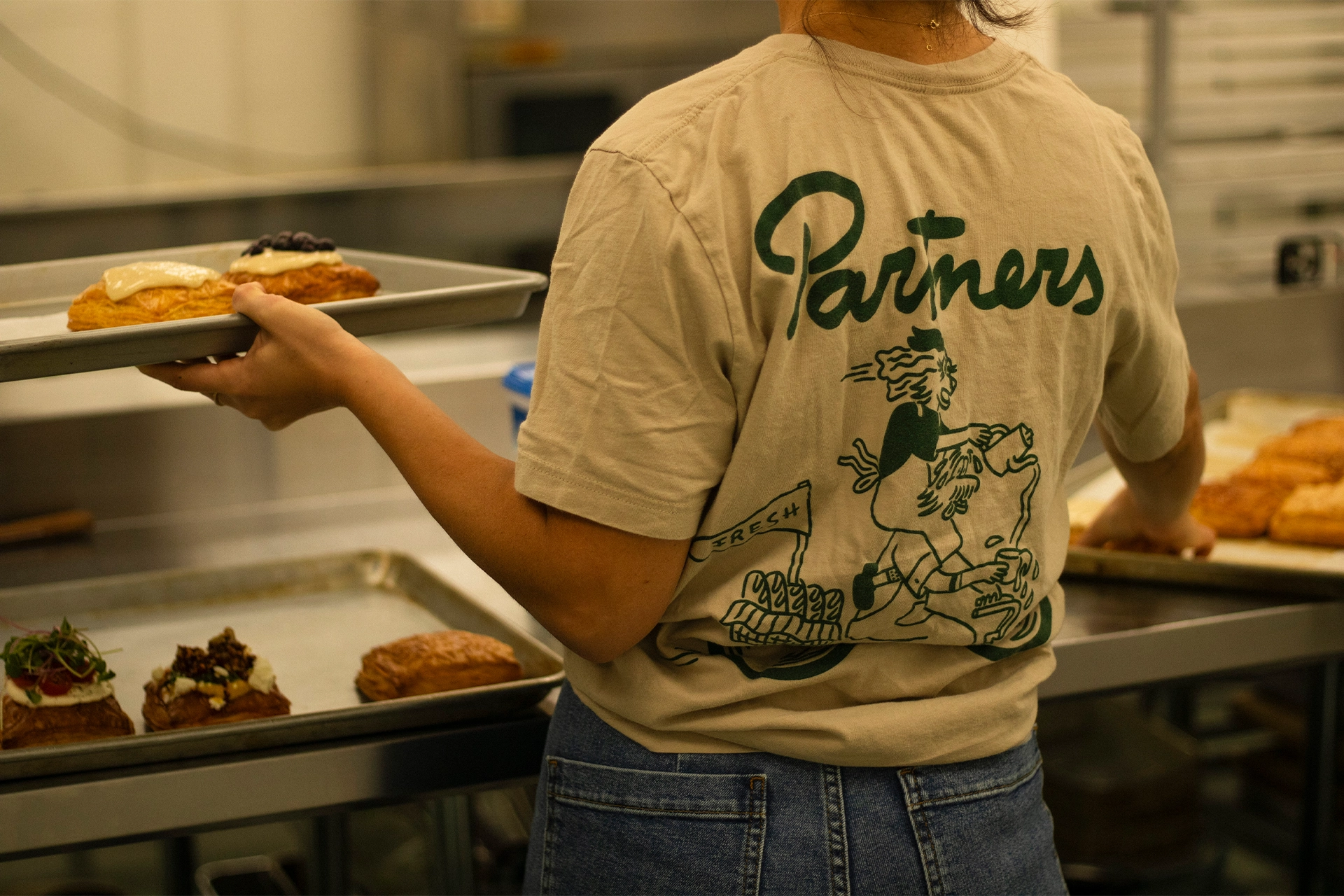
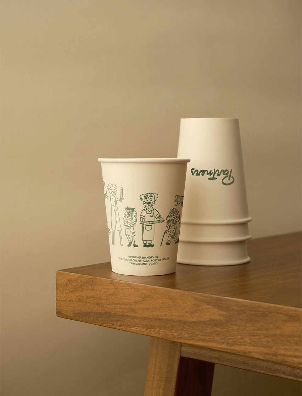
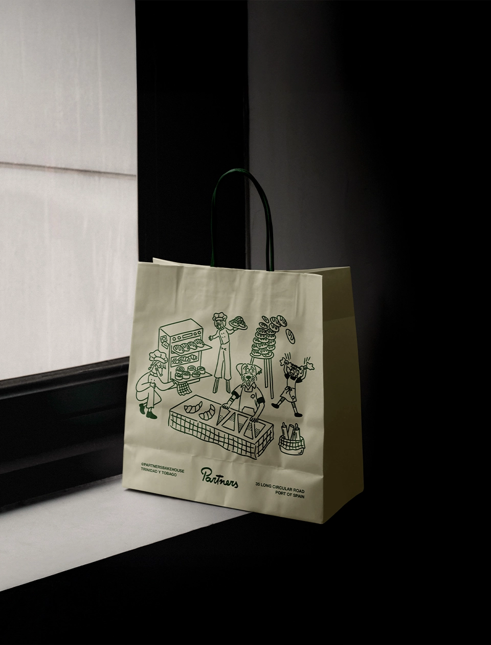
For the illustration system, we wanted to portray the everyday characters that shape the daily life of Partners. Each character was developed with a strong and recognizable personality, inspired by real customers of the bakery. These personalities were translated into dog breeds, creating a playful yet familiar visual language that resonates with the community: the gym bro as a bulldog, the old lady as a poodle, a football player as a greyhound, the girly girl as a Maltese, among many others. All characters coexist within a series of illustrated scenes, reinforcing the idea of Partners as a lively, local meeting point.
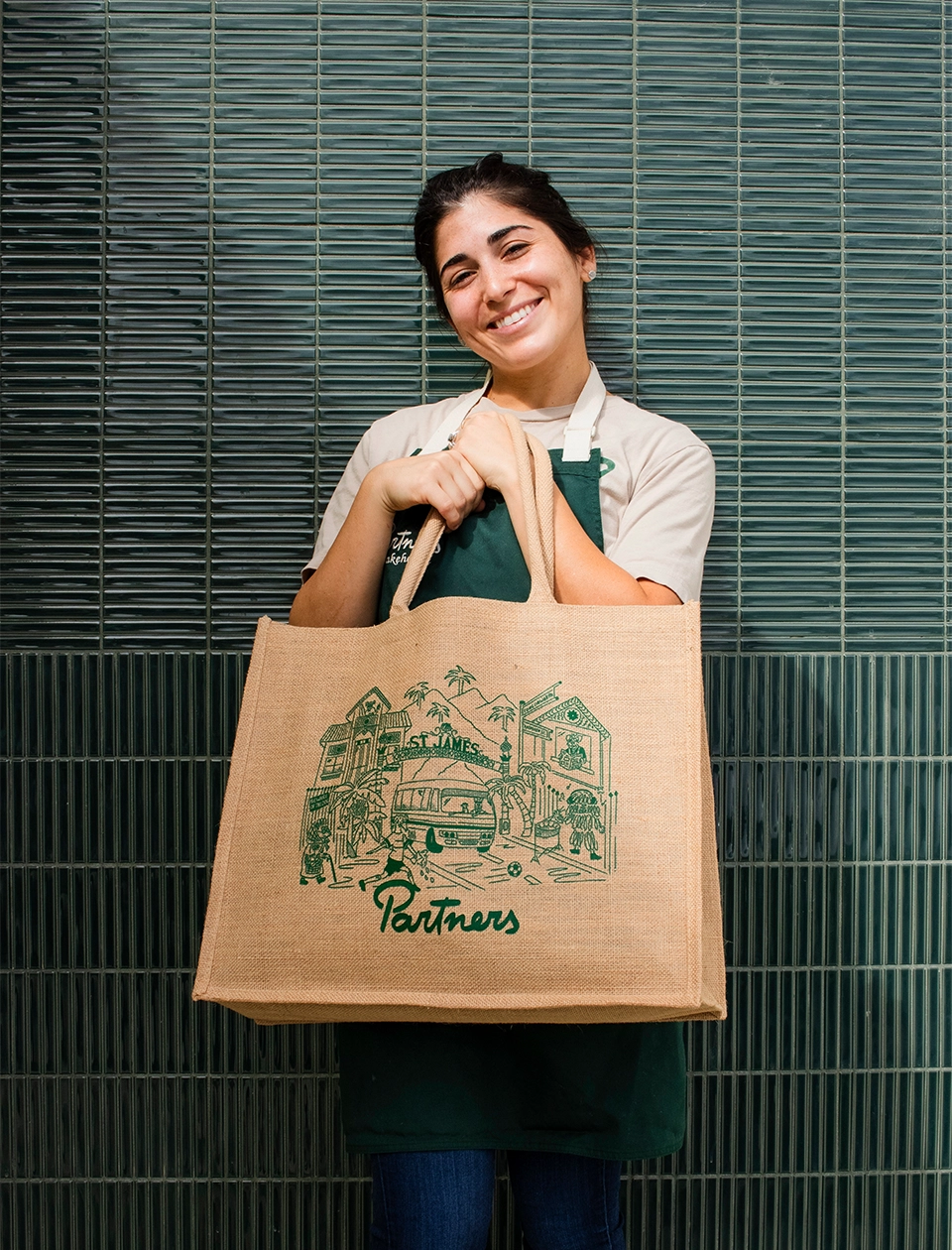
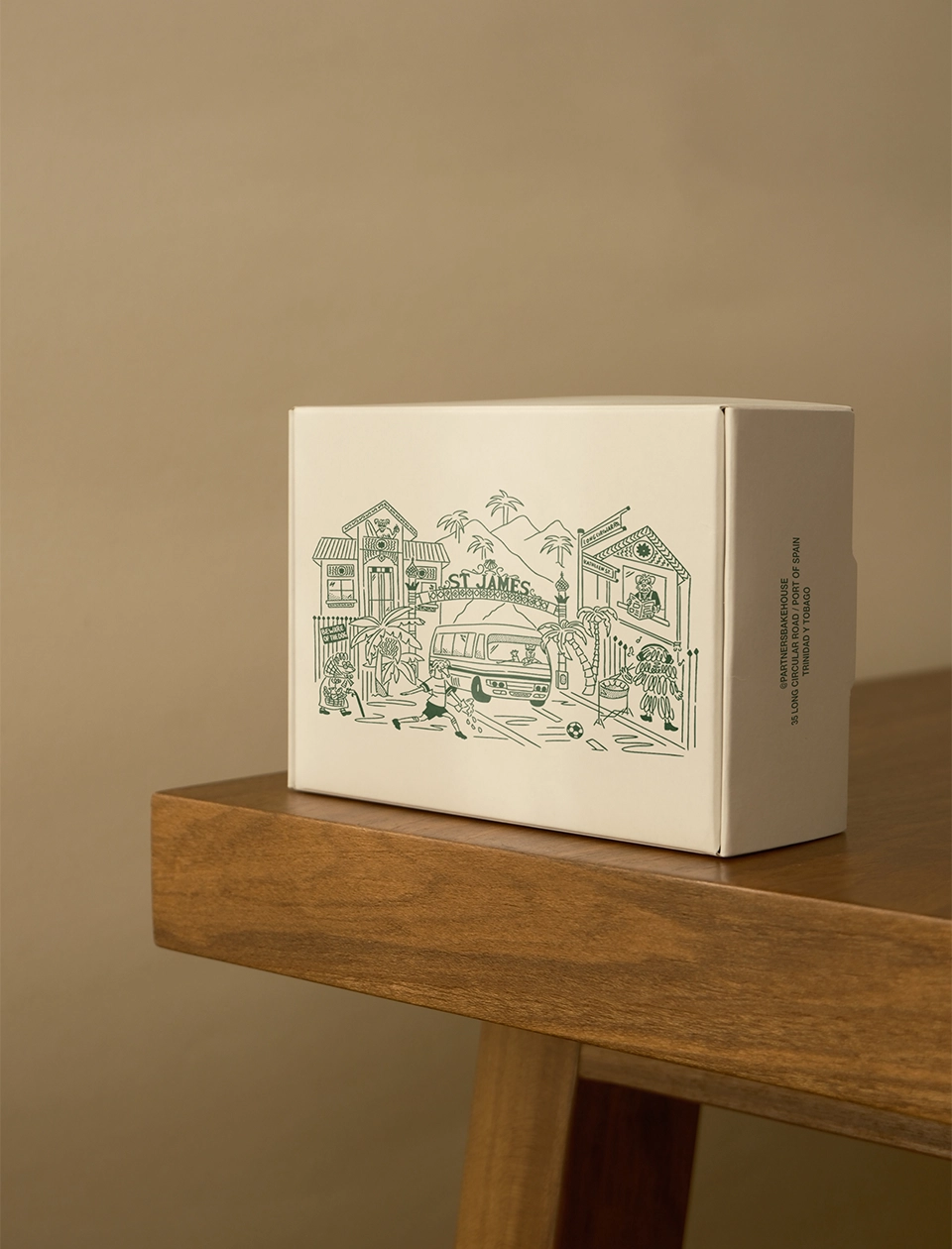
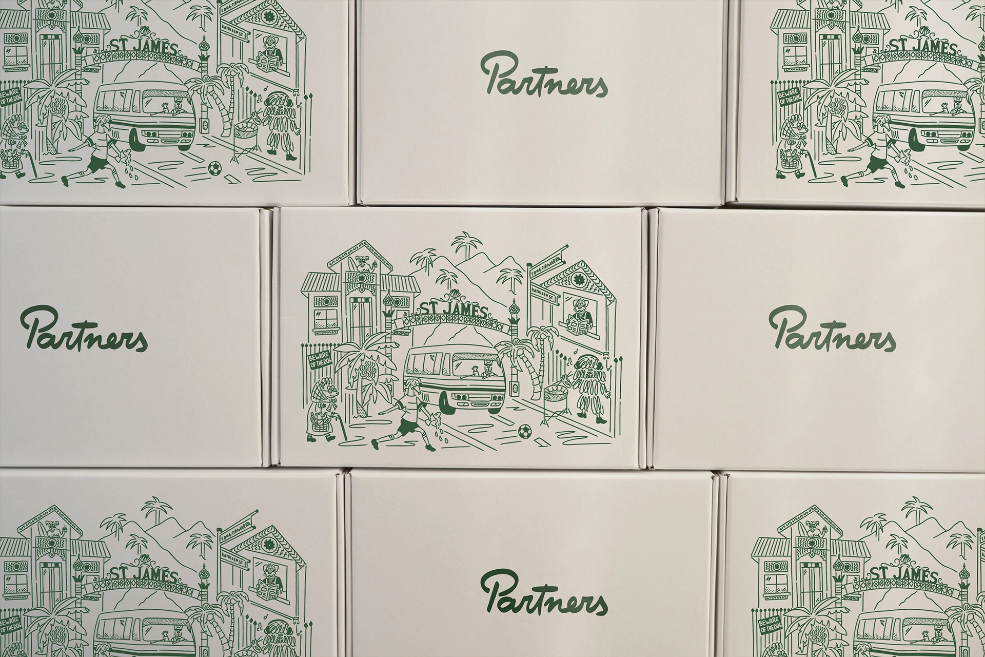
One of the most representative scenes illustrates Port of Spain, Trinidad and Tobago, where we depicted key local landmarks such as the iconic St. James Arch, the intersection of Long Circular Road and Kathleen Street, the city’s typical buses, palm trees, surrounding mountains, and neighbors peeking through their windows. This scene acts as a visual anchor for the brand, reinforcing its strong sense of place and community.
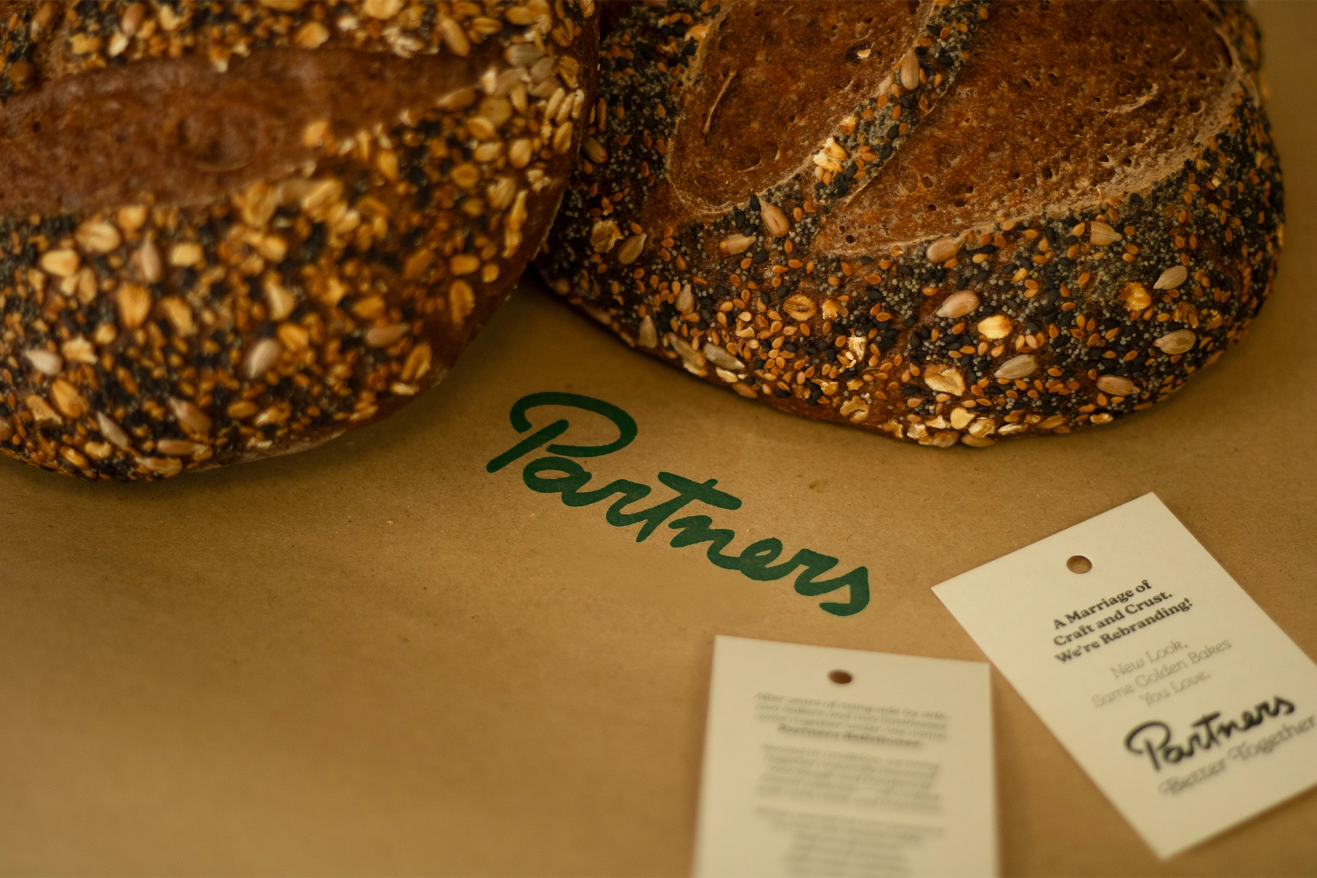
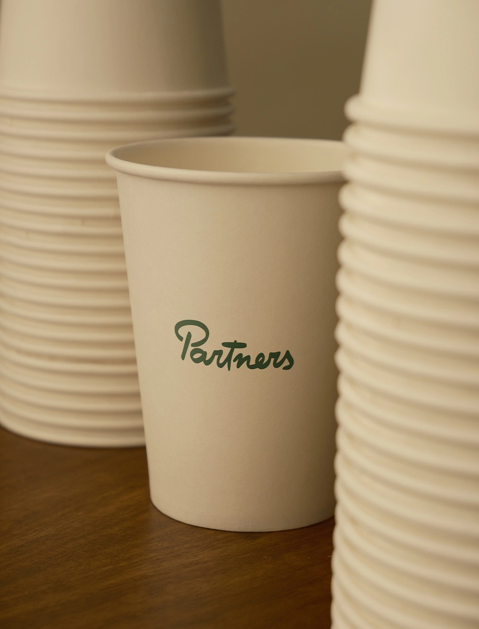
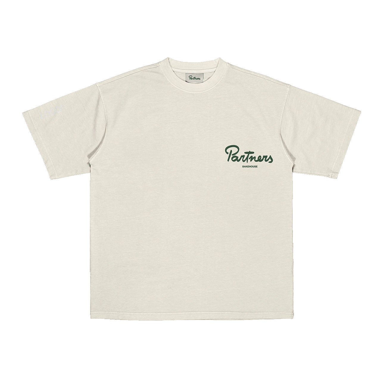
The identity was applied across a wide range of brand touchpoints, including staff and customer t-shirts, aprons, cup designs, greaseproof paper, boxes, multiple paper bag formats for different pastries and breads, tote bags, stickers, menus, napkins, and more. These applications helped ensure a consistent and immersive brand experience across both customer-facing and operational elements.
Client: Partners Bakehouse Location: Port of Spain, Trinidad & Tobago Year: 2025 Work: Branding, Packaging, Illustrations, Brand Applications, Social Media Identity