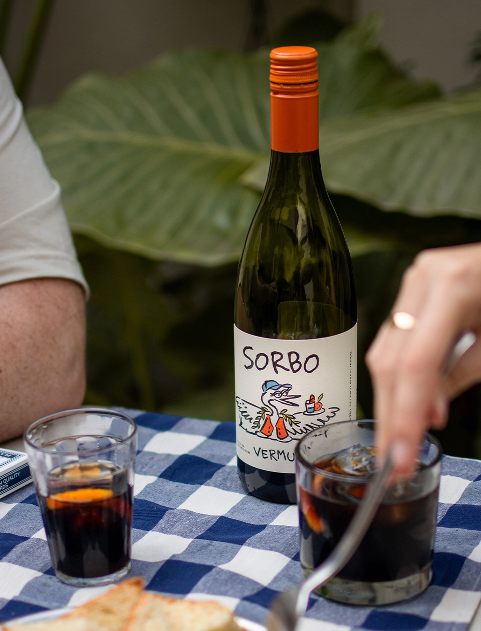
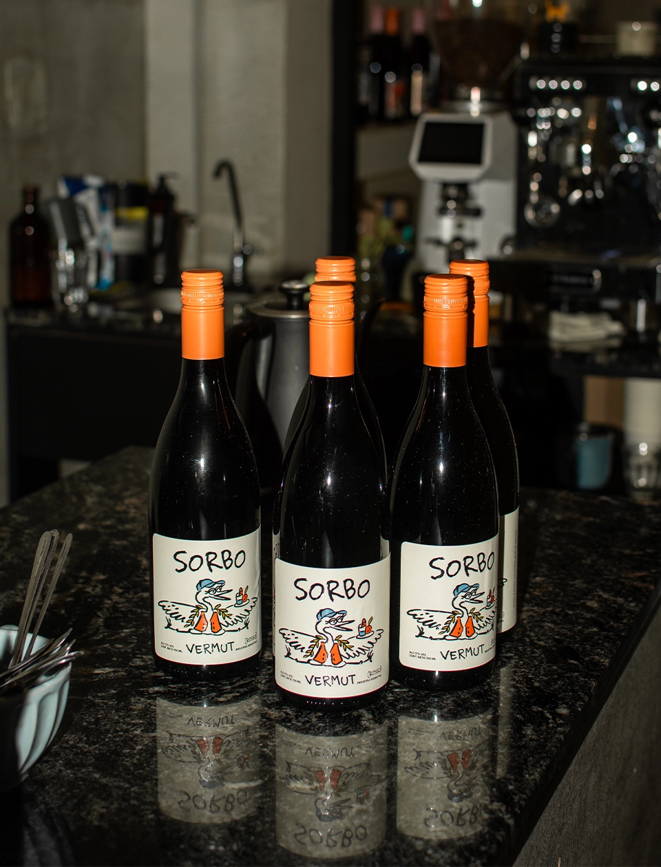
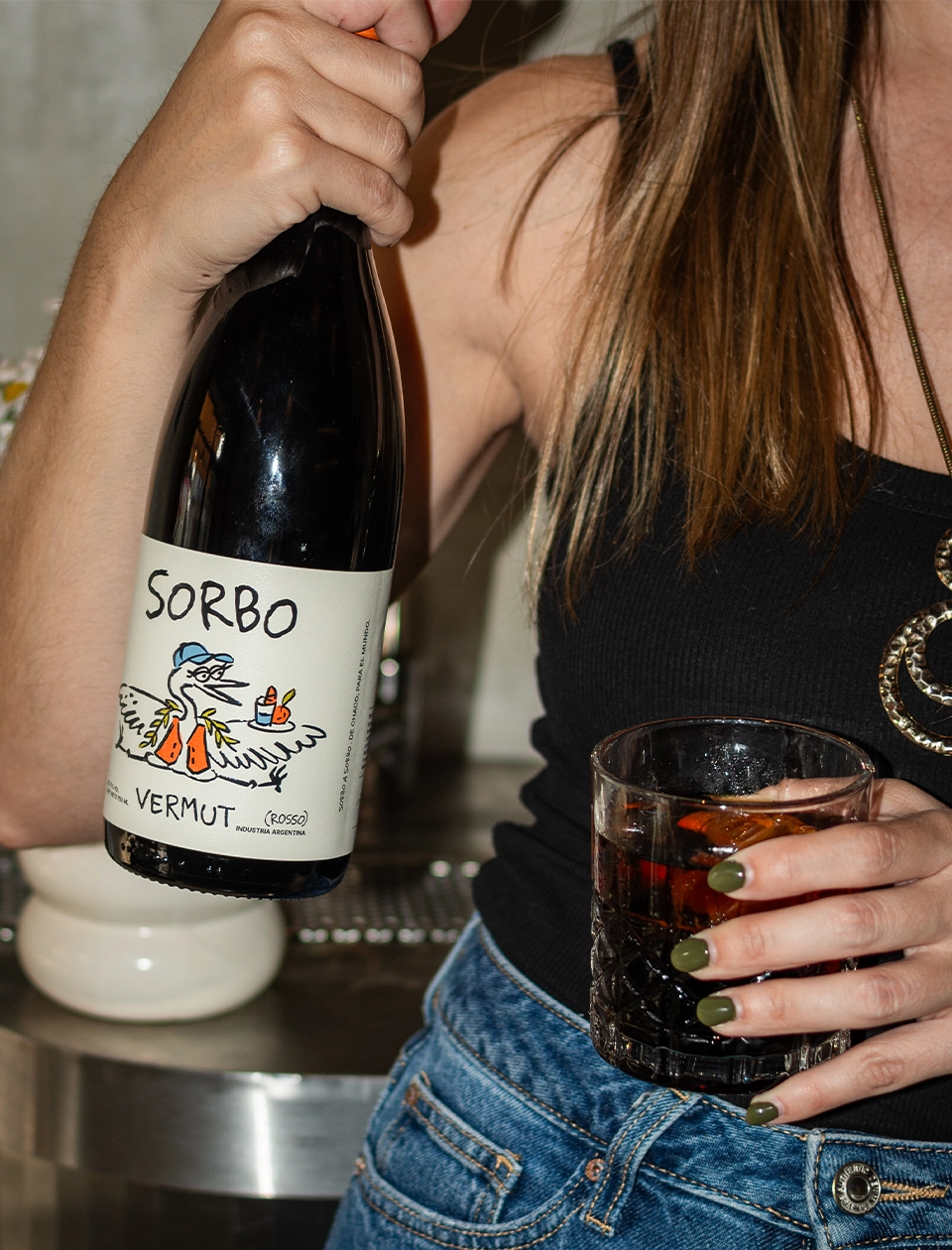
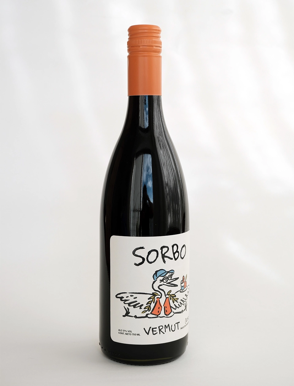
Sorbo is a vermouth born in the province of Chaco, Argentina, combining native botanicals from the region with grapes sourced from Mendoza, where it is also produced. A proposal that brings together two territories, highlighting the ingredients, flavors, and landscapes that are uniquely our own.
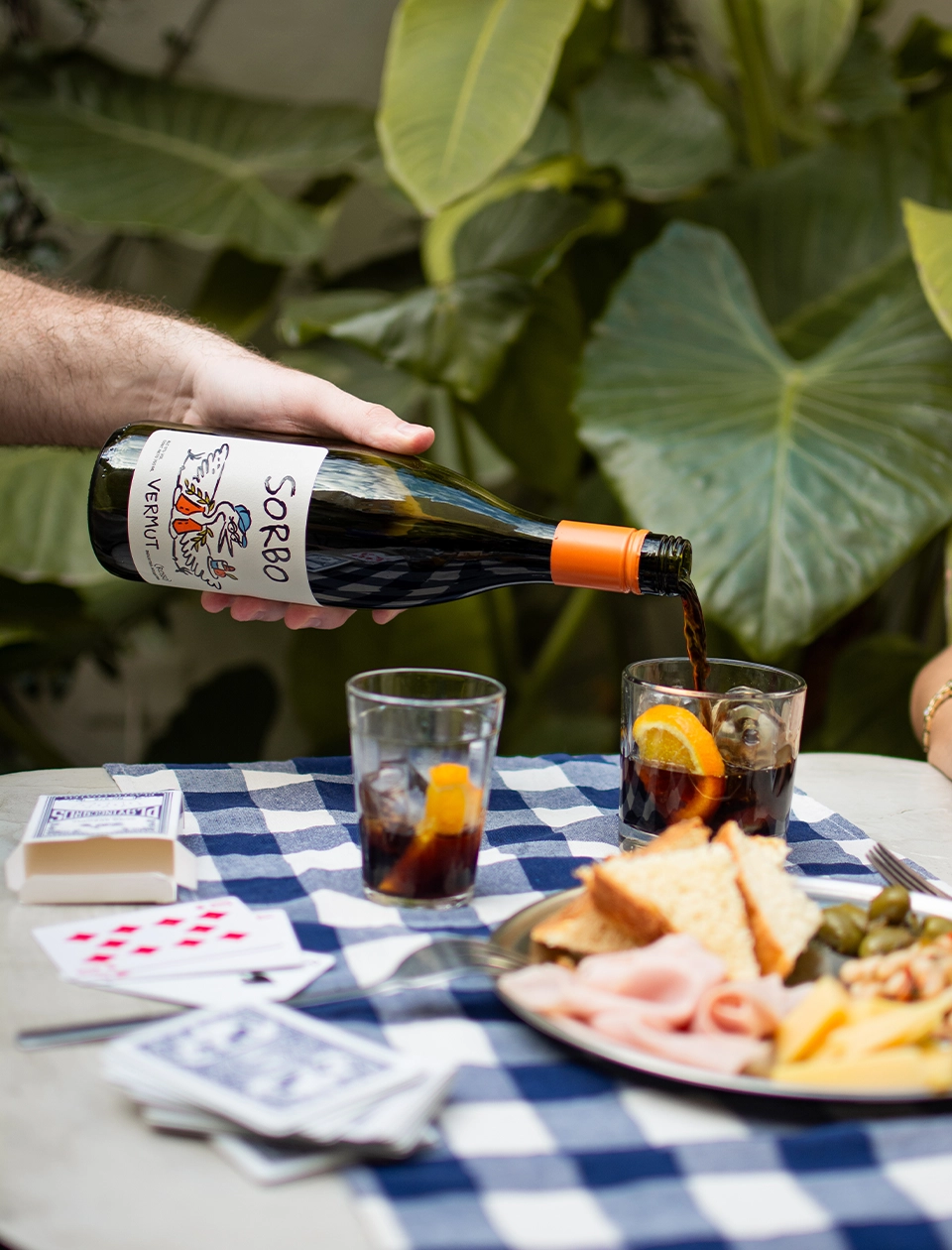
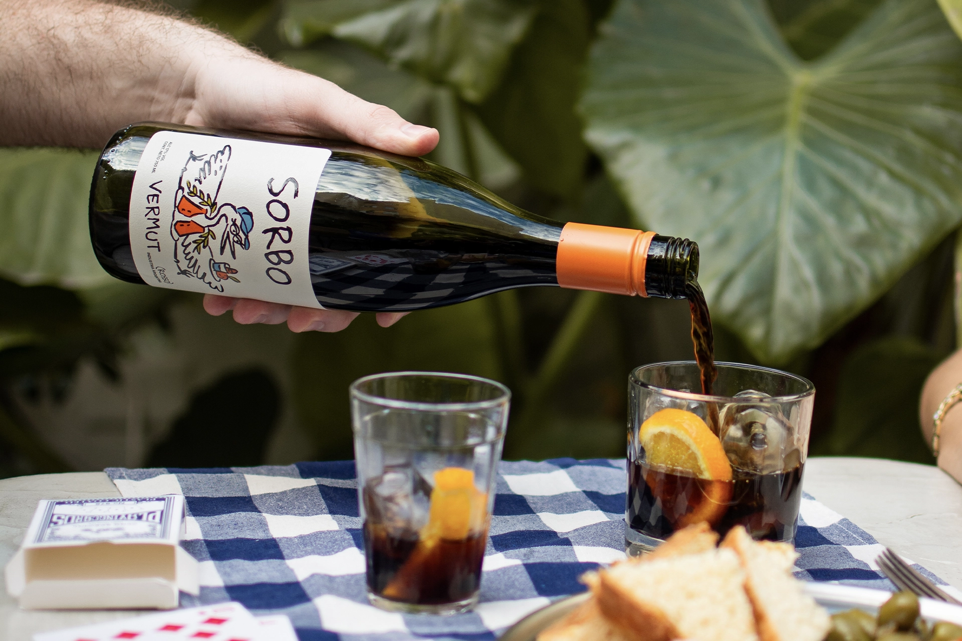
From the very beginning, we had one clear goal: To build an identity that moved away from the traditional Italian imagery associated with vermouth and felt more distinctive, irreverent, and fun. An identity that could convey the story behind the brand and its spirit: A fresh, unpretentious vermouth, the kind that invites you to linger a little longer around the table with friends and family. Because the best sip is the one you share.
We didn’t want Sorbo to be a vermouth that went unnoticed. We wanted the design to add to the experience, to have a strong presence on the table, and to become part of those memorable moments. Not just because of its flavor, but because of everything around it.
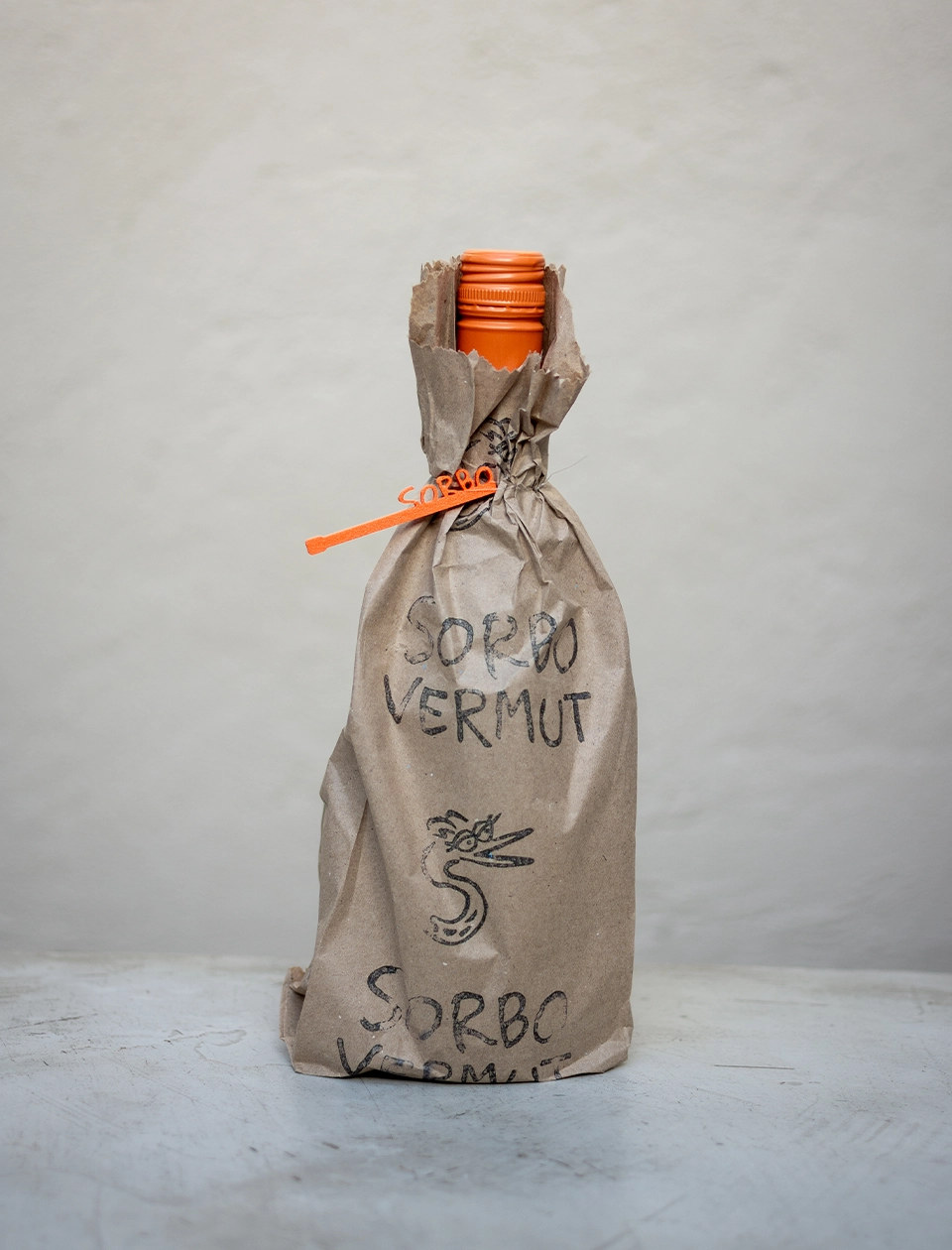
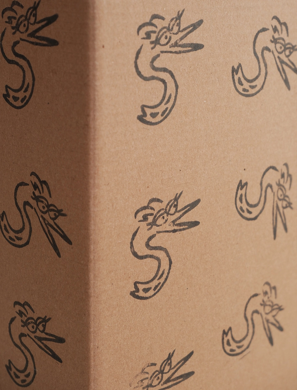
For Sorbo, we developed a comprehensive visual identity designed to create a recognizable, approachable brand universe with a strong personality. From the logo, symbol, color palette, and typographic system to the creation of an original character, a set of illustrations, and different patterns that expand and enrich the brand’s visual language.
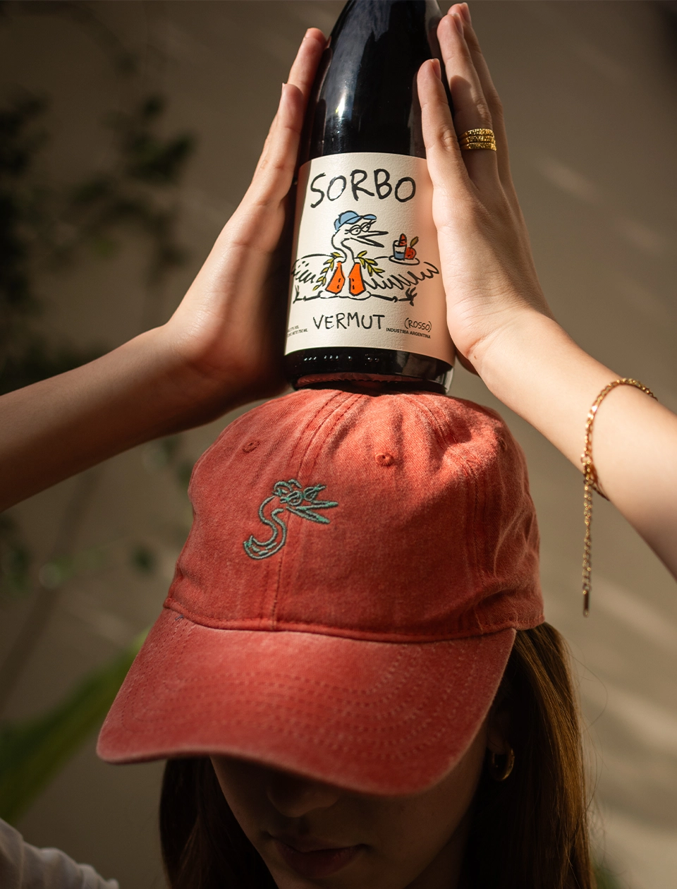
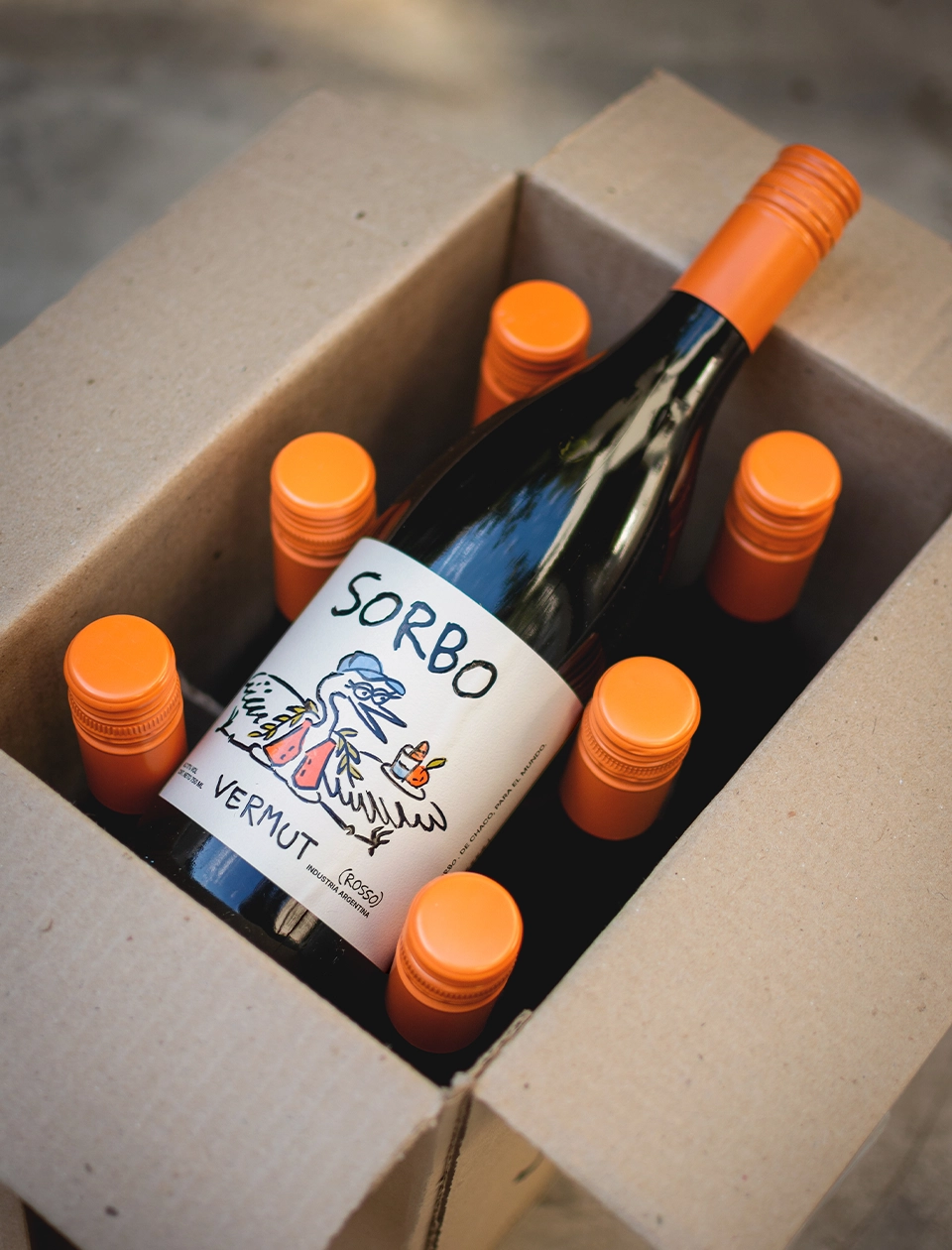
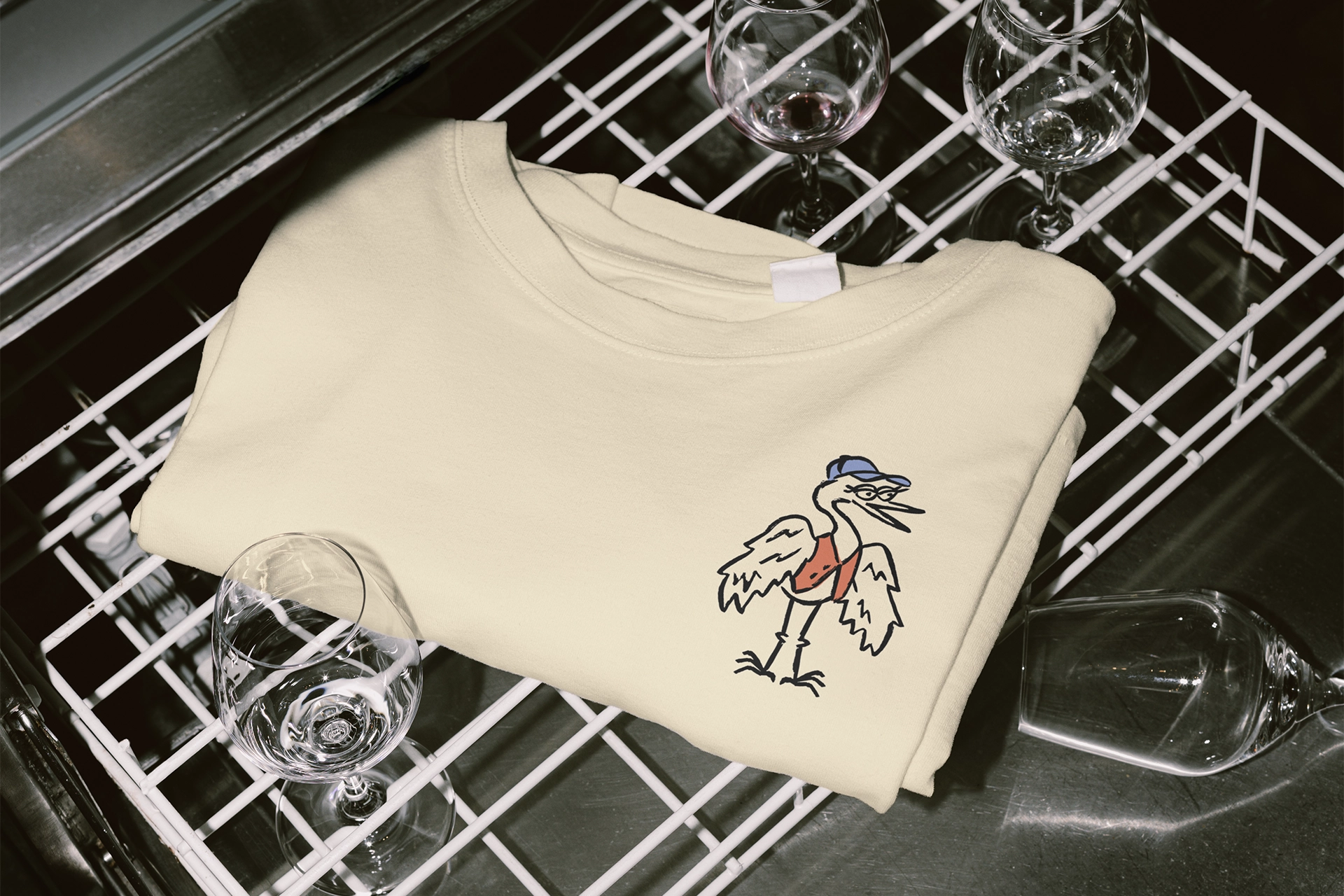
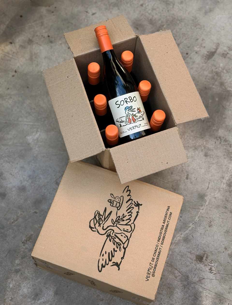
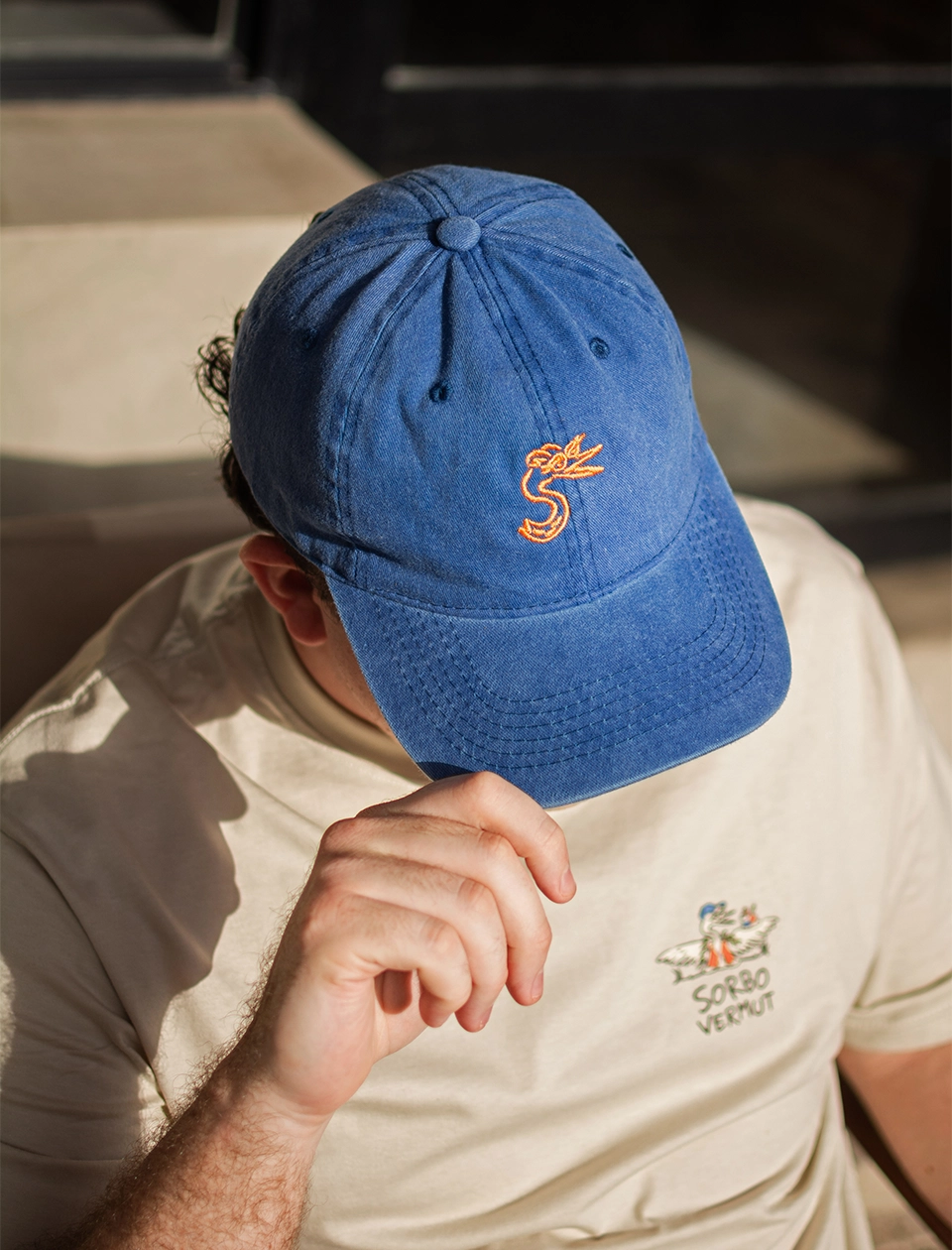
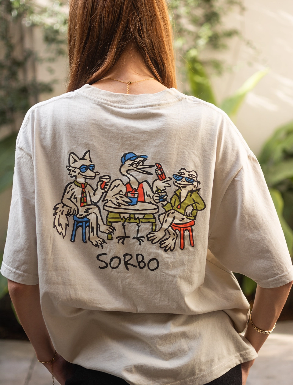
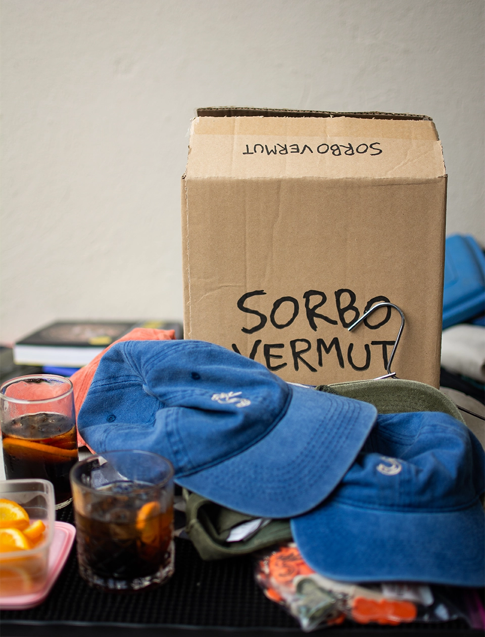
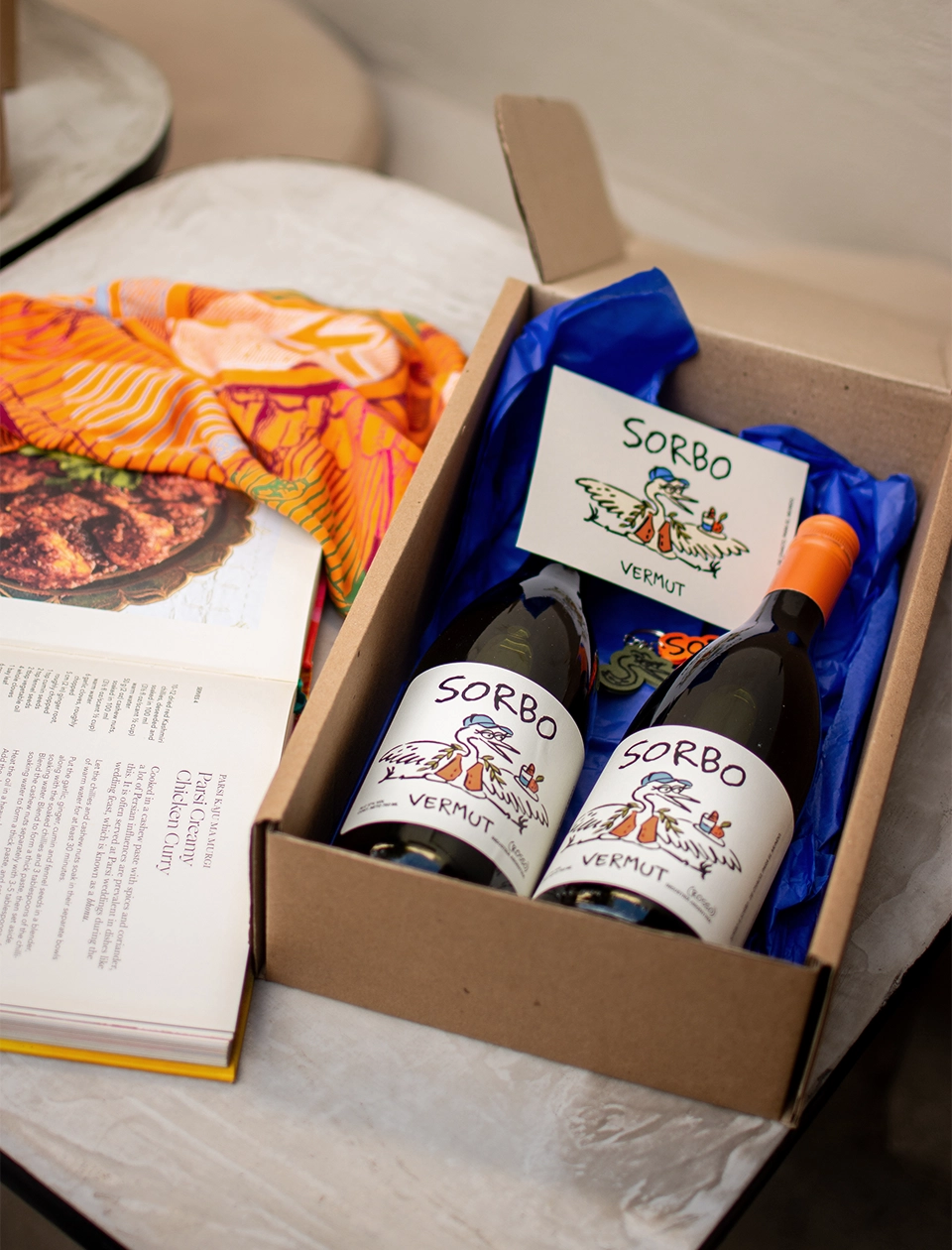
We brought this universe to the vermouth label and across a range of brand applications, designing boxes, stickers, and merchandise pieces such as caps, T-shirts, and tote bags. We also developed the visual identity for social media, ensuring that every touchpoint maintained the same personality and reinforced the overall Sorbo experience.
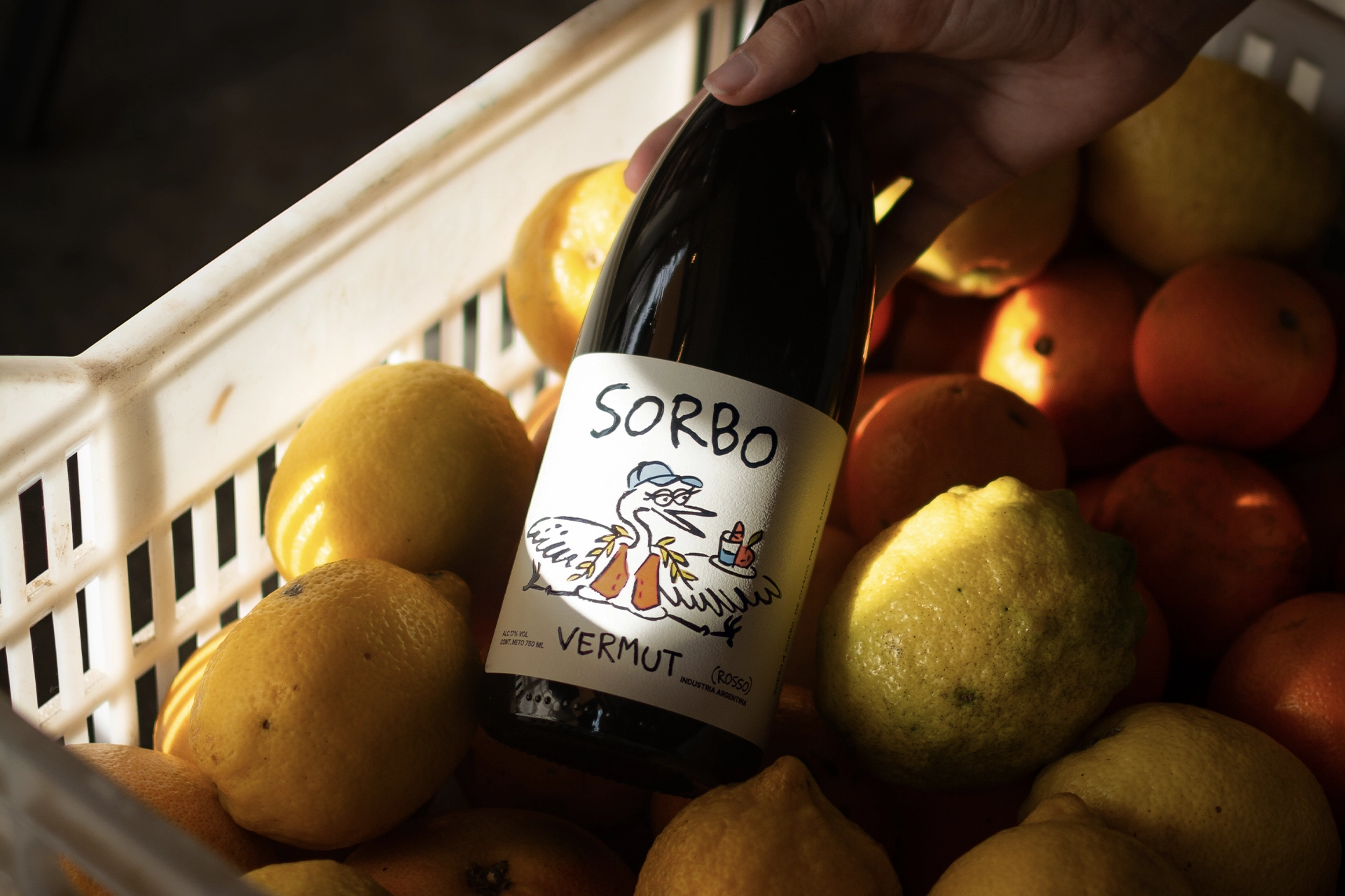
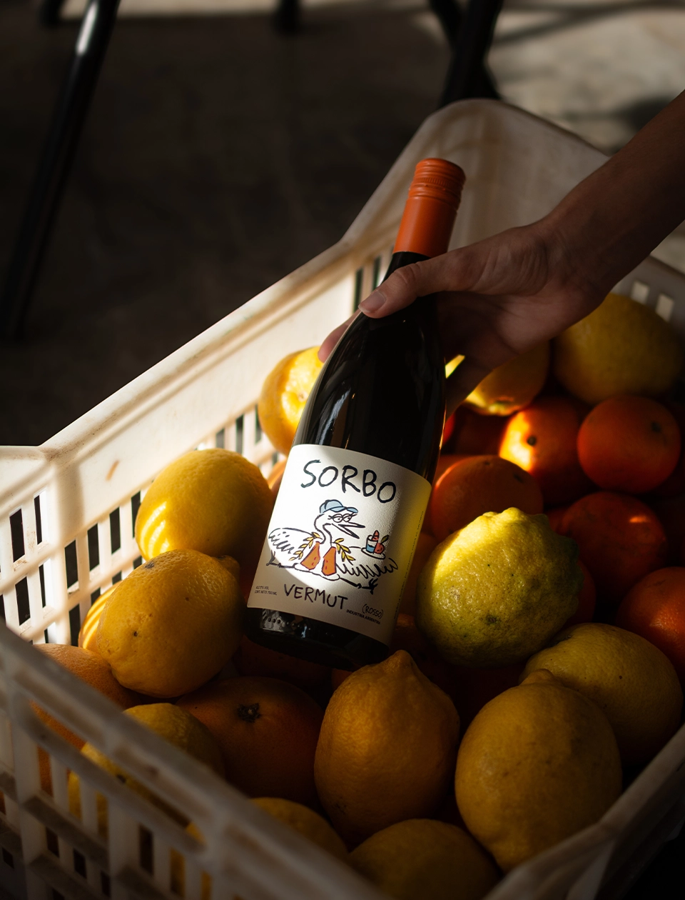
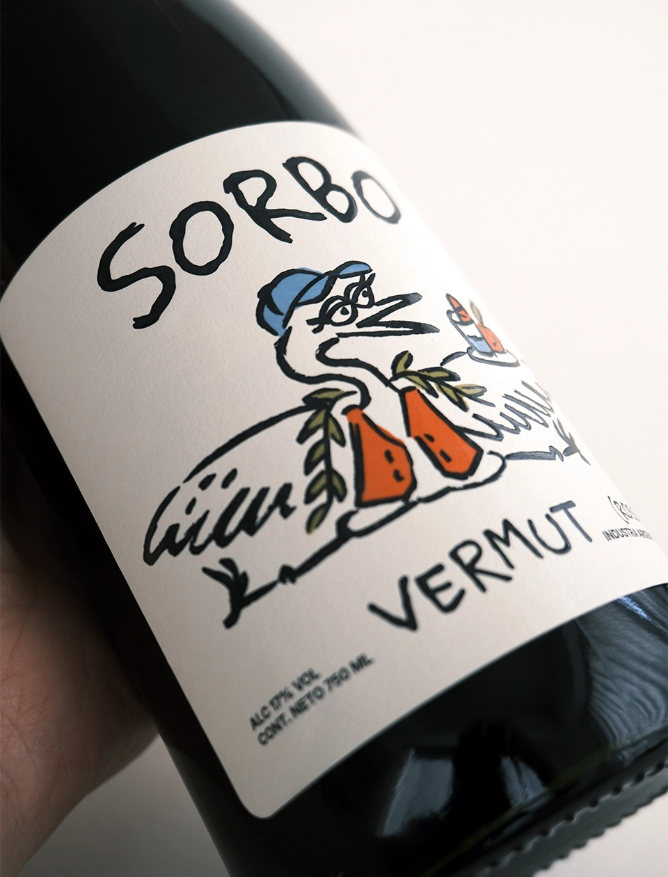
To build Sorbo’s visual universe, we created a character that would become the connecting thread throughout the entire identity: A heron inspired by the wildlife and landscapes of Chaco. She appears throughout all the illustrations, becoming the protagonist of the different scenes that make up the brand universe.
She is also at the heart of the symbol, where her face is integrated with Sorbo’s initial to form an S. In this way, the character is not simply an illustrative element, but an essential part of the brand’s visual recognition.
On the label, the heron is surrounded by elements that represent the essence of the vermouth: A burrito branch wrapped around her neck, referencing the botanicals used in the recipe. An orange, reflecting its distinctive citrus profile. And, of course, a glass of Sorbo. The heron thus becomes the character that travels through and connects the entire brand universe (from the symbol and illustrations to the label) building an identity that puts the local at the center, while approaching it from a fresh, playful, and unconventional perspective.
Client: Sorbo Location: Chaco, Argentina Year: 2026 Work: Branding, Packaging design, Illustrations, Brand Applications, Social Media Identity